My blog: codebite.xyz
hopefully this is not too much of self-advertising
So, in the spirit of eNgAgEmEnT, I wanted to get back to blogging stuff. As some of you know tho, I have a blog for that, but I thought I’ll still make a tread here, so you can comment (if you want) about whatever I post there here, since my blog doesn’t have a comment system, and most likely never will have.
Whenever I post something new, I’ll post it here to encourage some discussion, it might be a short post about whatever, a series of posts about some tech, or just a rant. Hopefully someone here will find it entertaining, or interesting.
There’s also an RSS feed.
FAQ:
Q: Why not just post stuff on the forums?
A: I like to have my stuff hosted on something I control.
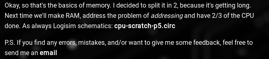
Q: CPU part 6 when?
A: Whenever I feel like it (check projects/other/cpudev)
Q: Those white images on black BG look awful.
A: Not really a question, but yeah. The site used to have light theme.
The “C” course was like a training course that I went to while I still was in school.
In college they taught Pascal, C++ and bit of C#.
In uni it was C#, Java, Scheme.
Everything in the actual education was very surface level and pretty meh. Most stuff I know, I know by tinkering myself, and/or reading on the internet.
Not much of a tech book reader, they’re usually so fucking boring lol. I like to get my hands dirty.
you’re website, while I like it… and I definitely haven’t clicked on your profile link once a week for about 2 months to be immediately disappointed when I see WIP
that’s the thing, I’m not sure…
I maybe I just feel it’s too smoooothh
maybe the font is just a size too large.
I’ll have to think about this, when i get a moment I’ll just stare at it for like an hour, then maybe I can give you a solid feel for it, I just don’t know, something seems a little jarring
notice the lack of diff between the bold and normal text triggered
it bugs my eyes, an easy fix is to make the font just a little bigger on the header, or make the main body a little smaller… Doesn’t fix the strange nature between the bold and normal text (and their “contrast”) but the font isn’t bad besides that… i think.

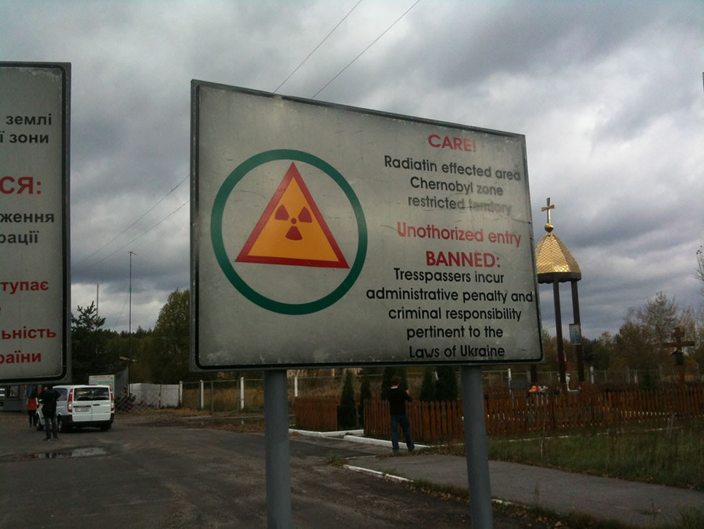
 abandoned ] Let's Build a CPU