This thread ended in a discussion about font software and licensing. I meant to respond to it, but I think it’s better to split it off to a new thread to discuss since it’s tangential to that OP.
@Dynamic_Gravity, I’m going to respond to your post, but I don’t mean to call you out or anything. Just want to continue the discussion:
Fonts are a huge deal. All of the intellectual energy that we pour into technology, software, etc. is easily matched by that put into typography. Designing a good font is a huge undertaking that involves a high level of expertise and innumerable hours of labor. Some end up being free and others proprietary (just like software). In the end, each line, curve and weight all geometrically reference and compliment each other. It can be staggeringly complex.
The choice of font can have an enormous impact on how text is interpreted, and that is taken full advantage of in art, advertising, signage, etc. At this point, there are many very good open fonts, and if you don’t have a budget for fonts, you should absolutely use those. However, in a lot of cases, a proprietary font is preferred specifically so that it won’t be used in other contexts. A brand will exclusively license or even commission a font so that it can establish brand recognition with only a few letters.
This makes fonts very powerful and very valuable, but by their nature, they are very easy to use unlicensed (maliciously or accidentally). For this reason, complex software has been developed to track font licensing. The purpose of the software is essentially to avoid being sued. While licensing fonts can easily cost tens of thousands of dollars, if an unlicensed font were to find its way into an international ad campaign, the company responsible could face an extremely damaging civil suit.
I tend to use the ubuntu font for everything. I use it for my system font, when i type up any kind of document, etc. I just like the feel of it and how it flows but i dont need to sell it. The ubuntu website does that well enough
Ahh that makes more sense now, thanks for explaining it. I still think its dumb to have such a use-case, but I can respect the fact that it exists because some entities want it to.
I love tinkering with fonts. I love how different fonts work depending on what type of display you have (specifically thinking about resolution as well as technology, i.e. fonts @ high dpi or fonts on eink.
I’d like a recommendation though: I write all my university term papers in LaTeX, but still use Times New Roman - is there a nicer alternative serif font that looks professional and is free to use? The only one I have found that looks good is Linux Libertine, but I was wondering if there is more out there for academic papers.
Droid Serif should be an available one for your distro. I don’t think they’re grouped by use-case, but in many of the repo’s you have access to a wide variety of serif fonts.
I don’t generally care, and leave it up to the OS/Application/Site developers to choose their own styles and it’s usually fine. With code though, I have a strong preference for Adobe’s Source Code Pro.
What application are you using to handle your LaTeX? Since LaTeX is just a markup language, you should be able to use it with any font you like. That said, I’m not sure if your choice of fonts is limited by the extended mathematical characters that LaTeX uses.
I don’t know if there is a de facto academic font. It might be worth asking a professor? There should be many serif fonts to choose from in any OS. It’s just up to your personal taste really.
Google Fonts is a good resource if you don’t like what’s included with your OS.
Fonts are good, more fonts are better!
I just like to have “just the right font” on hand and have been collecting everything that works for the setting it may be at some point used for. Recently I began a group work for one class and our group needed a name and a logo. So I got creative and made a little logo by combining 3 different fonts and making one of the symbols italic.
…and then I have to writen an essay or assignment and it is back to Arial because it is simple and clean.
I used to be a Pre-Press Graphic Designer. I drove a Mac and printed to imagesetters that made the giant films that printing plates were made from. I worked extensively with typography, fonts and still love messing with fonts. When I was in university (pre-computers) most of my notebook doodles were inventing new fonts.
I learned a lot about fonts from the old school printers that used to set fonts by hand with individual metal letters. I learned about the terms like leading, tracking and kerning because those guys had to do it with tiny strips of lead stuck between each letter. They used automatic typesetters but had to do the adjustments by hand. What was amazing that even in the Macintosh era they could identify any font just by looking at it.
One problem in the modern era is plagiarism. For example on the Mac we had to license the real fonts like Helvetica. On the PC they had copies of Helvetica like Coolvetica.
Fonts are historically expensive to license as they take a lot of work to create. They are essentially licensed the same way as stock photography. You pay for certain usage rights.
We tend to take them for granted because so many are included in operating systems and other software (Adobe products for instance). The fonts included in Windows, macOS and Adobe applications were all licensed for redistribution. It’s part of what you’re paying for. I believe you have unlimited use for those fonts.
As discussed, there are also many free fonts now available which are very good, so there is no reason to pay for a font, unless you really really want a specific one, or you are passing the cost onto a client/business/whatever.
For instance, if you take a look at the licensing options for Helvetica Neue, you’ll see that you can “buy” the font for $35, or in bundles ranging up to about $1k. But you do not have unlimited usage rights. You have limited digital use, which is outlined in multiple EULA’s. If you wanted to use it for an international print ad campaign (billboards and such), then you would need to pay much more. This is the sort of thing that “font servers” help deal with. They’ll track which usage rights you have for particular fonts, and I believe even facilitate purchasing additional rights as needed.
The funny thing here is that Helvetica Neue is included in macOS, so, assuming I’m correct about the usage terms for fonts provided by the OS, you could use Helvetica Neue however you like as long as you own a Mac… I think at least. There may be some limitations when you get to the level of billboard. I’m not 100% sure.
That’s cheap. Mac fonts used to cost $1,000’s for a collection of them for the shop.
So we had to share. Only one person could open a font at a time.
Font design is SUPER HARD! It’s take years of study and expertise to make a Good Font. Most fonts are garbage and goofy. Real fonts take consortium’s doing research through years of art history and then ages to draw them up perfectly.
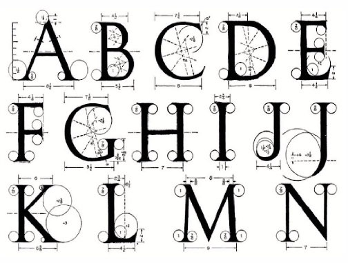
It’s important to remember that a font is technically a collection of vector graphics. Each letter is infinitely scalable. It doesn’t have a resolution. That means that each letter is essentially a complex graph. Every line, curve, and length is plotted mathematically.
So all of the lines and circles above have known mathematical relationships to each other. They aren’t just intuitively drawn. Granted, this is much easier now with vector graphics applications like Adobe Illustrator, but an experienced graphic designer will still be conscious of how the lengths, weights and curves all relate to each other. I’d equate font design to somewhere between being a painter and an architect.
Maybe. No matter what the task, direct experience is beneficial. Each aspect of a font has implicit meaning that someone who hasn’t studied fonts specifically wouldn’t be privy to. A lot of it has to do with unconscious impressions and subtle formal references.
That said, it would be interesting to see what a mathematician and CAD designer would come up with. However, I think the resulting font would be even more expensive.
I think you have a good point about fonts and games.
There are great AAA games that are worth the full $60 price. There are indie games that cost $5. There are garbage games that are only worth $5, but they try to get suckers to pay $60 for them because the suckers don’t know what a good game is.
Same with fonts. Really good ones are expensive for a reason. Because the designer has to be historian, engineer, architect and artist at the same time. But anyone can buy a FontMaker app, start cranking out a bunch of not-so-great fonts and try to charge too much for them.
Adobe has tons of fonts included in Photoshop. In some cases using a weird font is Okay. But out of the 100 or so included in the package, there are maybe a dozen that I use most of the time.
This extends Google’s reach into the everyday experience of consuming content. If a considerable percentage of content creators are using Google fonts and are adhering to the principles of Material Design because it is free and convenient, then essentially, Google’s branding becomes much more universal than if they had kept it all to themselves. Ideally (for Google), when you pick up an Apple or Microsoft product and the design principles are different, the experience becomes awkward and unfamiliar.
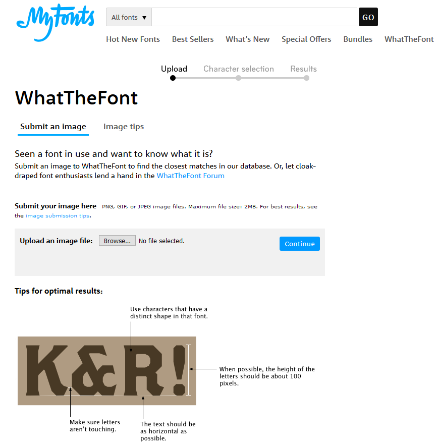
I didn’t know this, thanks for letting us know. Also is there like a database or a website that shows or compares similar fonts? Oh btw is this even legal?
I use this a lot. I upload a Jpeg of a word in an unknown font. ‘What The Font’ can figure out what font it actually is. Then it has links to the real font but I can usually find a free one that’s close enough.