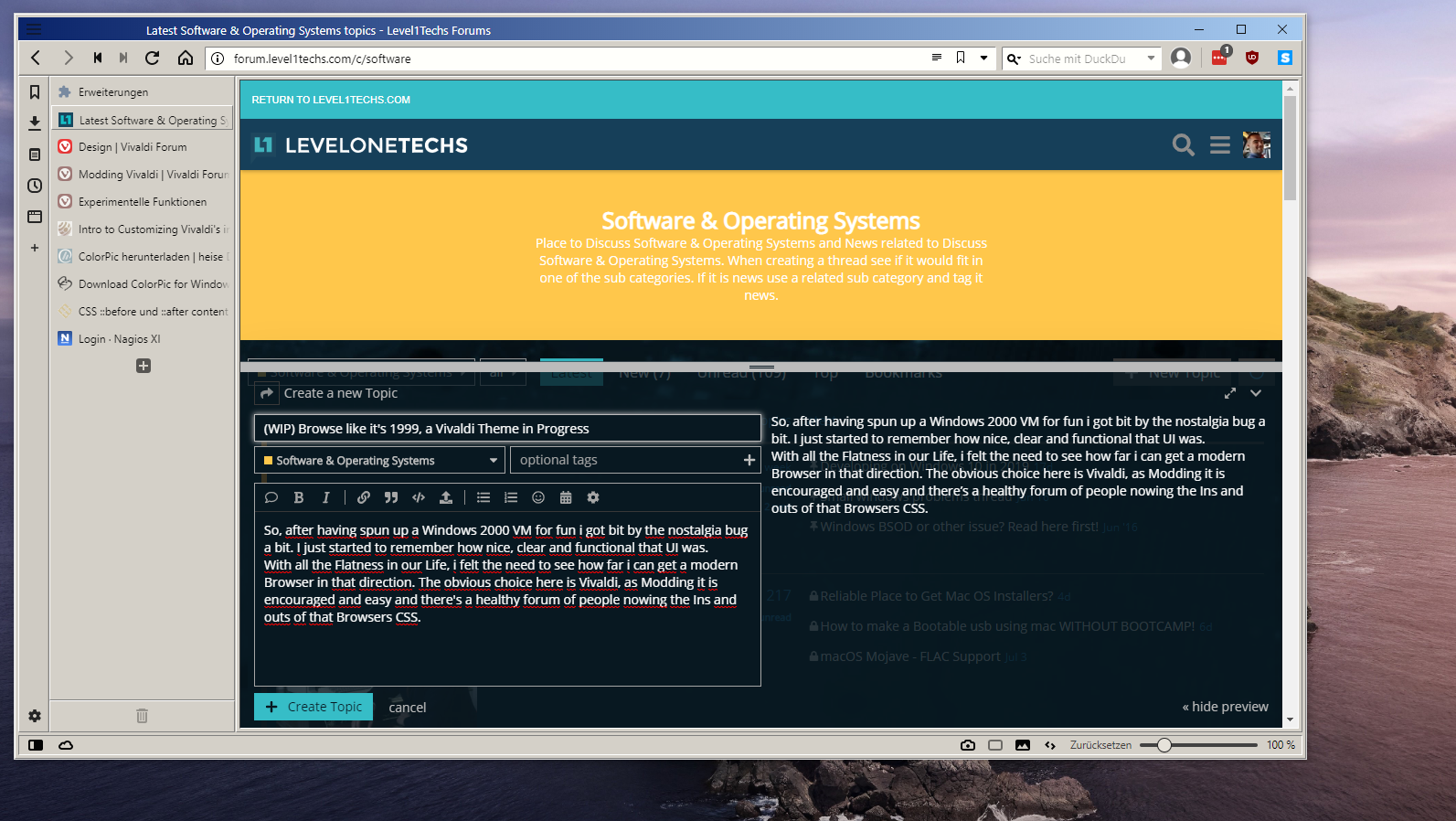
So, after having spun up a Windows 2000 VM for fun i got bit by the nostalgia bug a bit. I just started to remember how nice, clear and functional that UI was.
With all the Flatness in our Life, i felt the need to see how far i can get a modern Browser in that direction. The obvious choice here is Vivaldi, as Modding it is encouraged and easy and there’s a healthy forum of people nowing the Ins and outs of that Browsers CSS.
This is an hour of work in and far, far from finished. I just looked at my VM, picked some colors off of it and tried to get the basics down.
The goal is to keep supporting vivaldies color Settings, but keep the overal aestethics in tact. Icons are missing, as i’m not sure yet where to get Win 2000 or IE5 icons. The scrollbar is another point that’s not clear yet.
UI Font is to be determined. I’m looking at the original Font and some alternatives.
If you are intimitly familiar with the Win 2000 era UI, CSS or just feel like you have something to contribute, feel free to point out any flaws in the UI. The goal is to get this as close as possible. And most of the time, the more eyes, the better.
I’m still at work, so i’ll post the CSS file later for anyone interested. Also feel free to make any suggestions on how to integrate elements that just didn’t exist back then. Oh, and don’t miss the opportunity to call me a mad man. I just still think Windows 2000 had the best design of any OS to date in terms of consistency and usability.
Thanks for the feedback Guys! I appreciate it.
I quickly created a Gitlab Repo and uploaded the CSS so far:
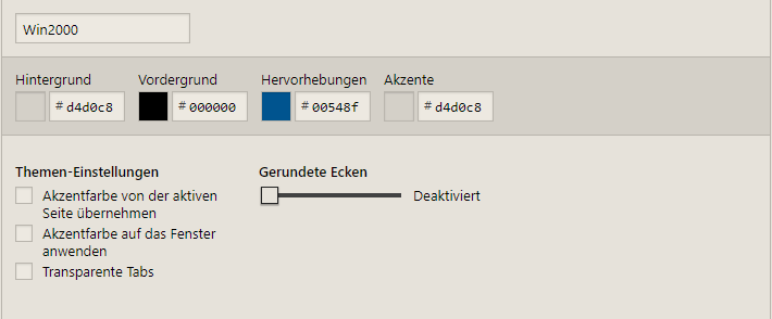
Since i’m trying to make this work with Vivaldis Theme Settings, you have to set up the colors youself:
The third color can be anything you want. It isn’t used in the UI so far.
I only tested it with Tabs on the left without Preview images so far. If you happen to test it with other configurations, i’d be happy to accept feedback and trying to work out the kinks. I’ll now go back to refining this stuff and getting a hold of the icons. Also, i’m not using the “Color based on Tab Content” thingy, as that wouldn’t work with the aestethic in my opinion. I’ll try to get it to integrate later though. For now, it just looks like random Color On/Off glitching
Ok, i know it was long ago, but anyone have a clue where the “Home, Forward, Backward” Buttons came from? I have the Windows 2000 CD and am working through the stuff.
It wasn’t included in shell32.dll and iexplorer.exe also doesn’t have those icons in it. I’m not looking forward to going through every single dll and executable on that disk. Icon Packs aren’t out there, so the original source is where i need to get those from…
Might be. Not sure. I’d have to scan the Win2000 VM for those.
Getting to the icons isn’t the Problem. 7zip extracts dll and exe files and the icons are just in there. I’m just not sure where the heck some icons come from…
Concerning Icons, some Progress is made. Trying to stay close to what IE used, the first Icons are in place:
So, i let that run over the entire C: Drive of my 2000 VM. I zipped up the 4000+ Icons that came out of it and put them on the Repo if anyone needs them for their Projects. So far, it doesn’t seem like the explorer “Back and Forware” Buttons are included in there. Makes me think they either aren’t icons or are somwhere completely else.
Since IE and the windows explorer use the same icons, i’m inclined to believe those aren’t IE specific, which is a bummer. I’m investigating further.
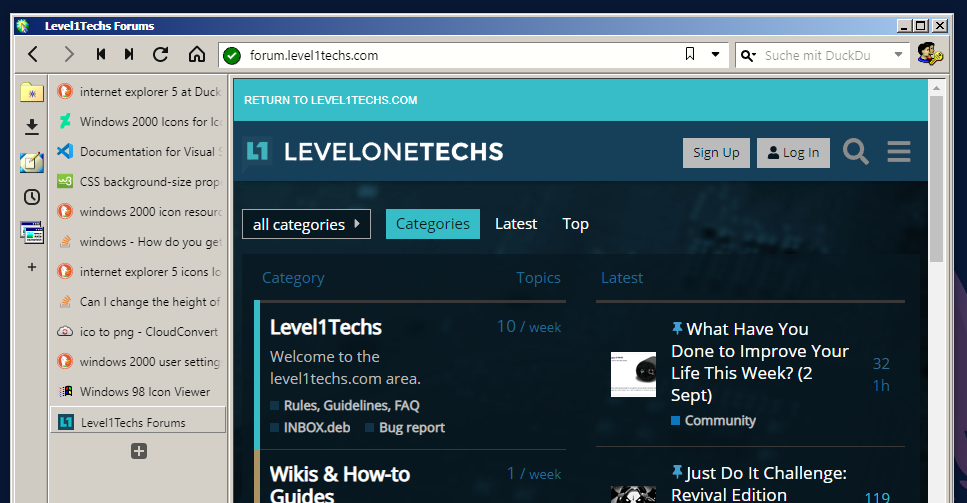
Font’s are obviously anit-aliased. But other than that, min-max-close, title and menu-icon should match pixelperfect now. This is only on 100% scaling in windows and vivaldi. I’ll test with scalling a bit later, but making a Windows 2000 theme Hi-DPI compliant isn’t exactly priority number 1 on the list
Back and forward button are in and sizes for adress and searchbar fit. Measurements from the original don’t work here anymore because of dual borders in the Original and the way border and outline work in CSS. Tried getting it as close as possible. Also, Buttons are currently adressed by number, which can cause issues with reading mode icon. Not sure how to address this jet.
Am also debating on wether i want to add the Button Text or not. Plus, as flexible as Vivaldi is, i can’t add another tollbar, nor can i remove/Rearrange the buttons.
I start feeling like Firefox might have been a better idea. Though they seem to be on the way of dropping CSS Support so…
What ever. Progress is slow, as i’ve get other work to do and am basically painting those icons by hand now, which is really time consuming.
A few, yes. Not all of them though. Hover states aren’t screenshotable, and some come out slightly scaled or such and don’t match perfectly.
It’s also only the Toolbar icons i have to make. Everything else i have in icon format already.
Manually coloring is tedious non the less. Plus i’m still debating switching this Project to firefox.