Hi,
I’m looking for a very specific CSS style that allow for responsive container width based on the amount of text. But there is a caveat - height of the container should be always 100% and no whitespace after the text block is allowed.
I tried many different options with flexboxes, grids, columns and fit-content parameter, but I found this to be very tricky.
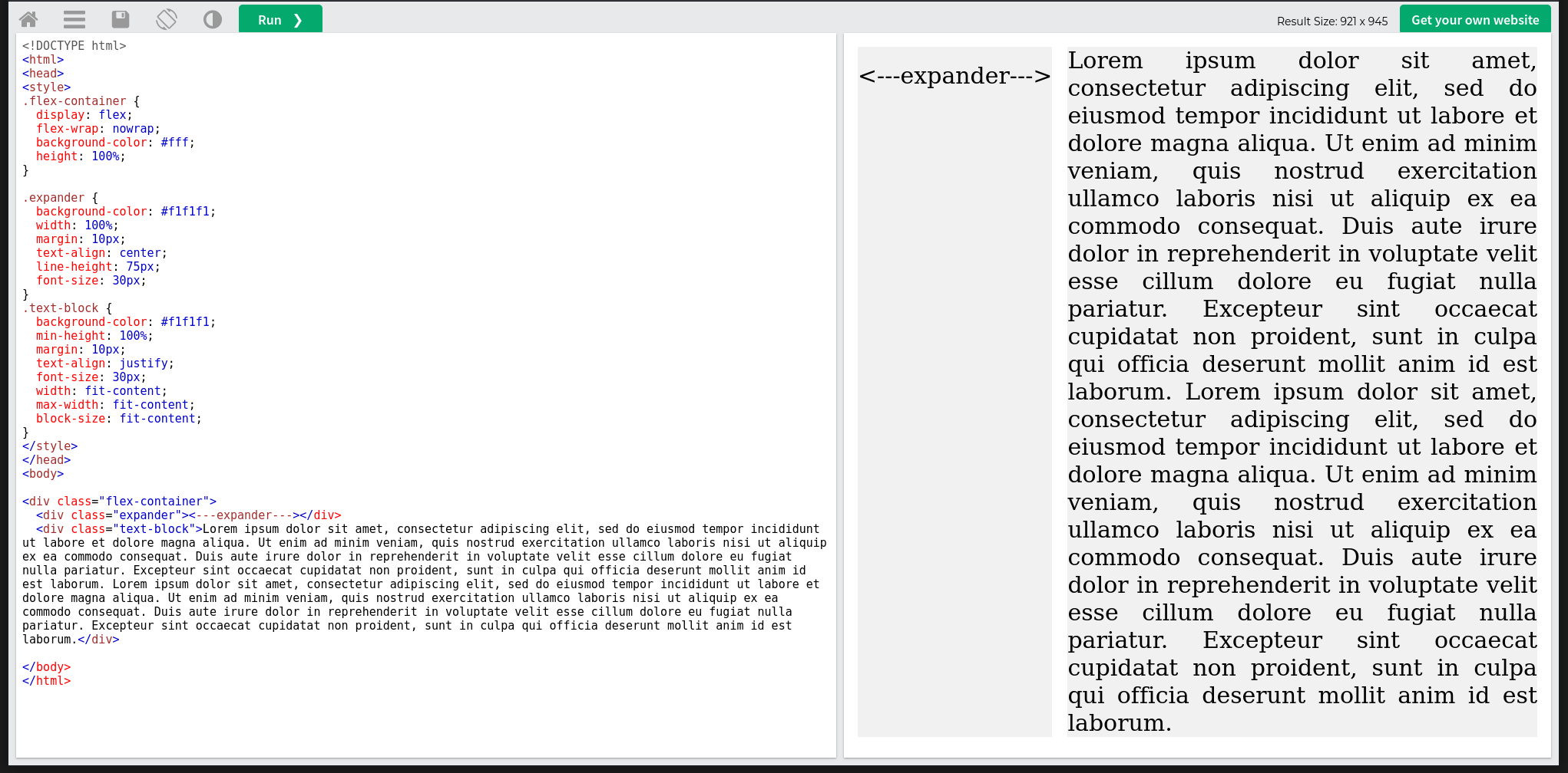
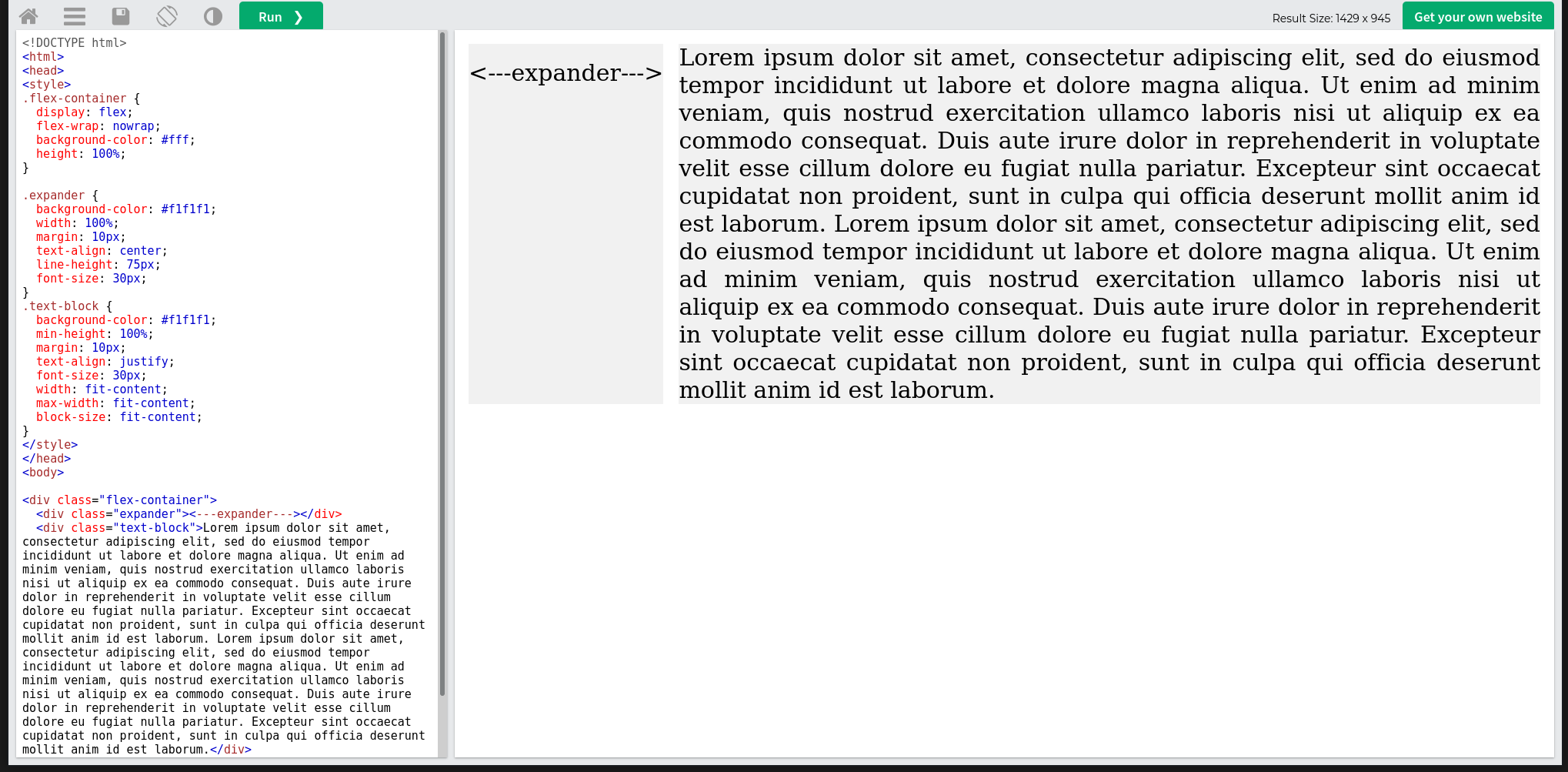
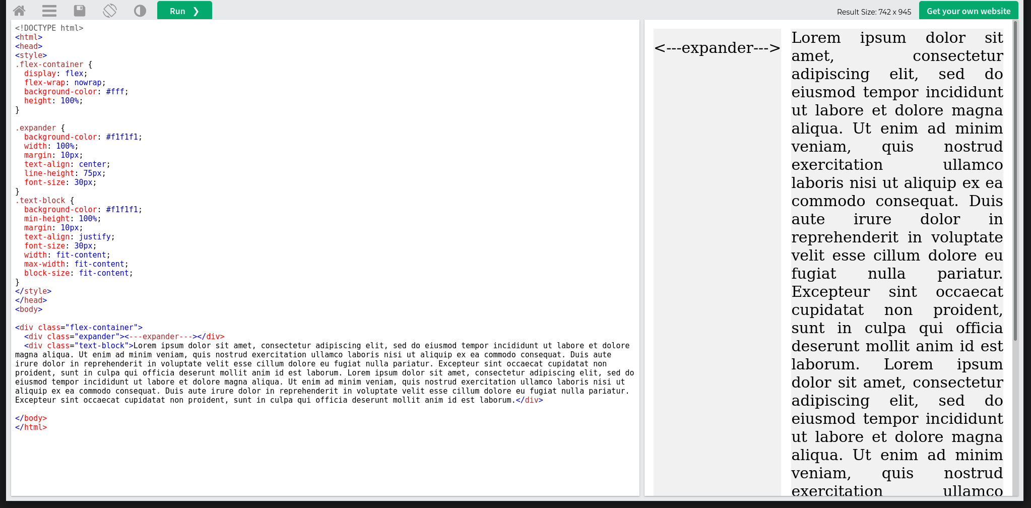
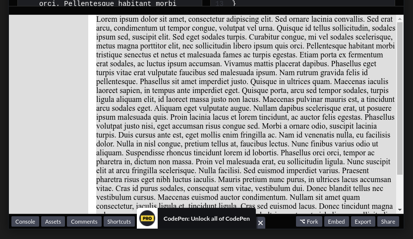
Desired result should look somewhat like the text block in screenshot - ignore code window, and pretend the expander takes entire space on the left in the viewport. Text column has the 100% height of the viewport, and there is no empty space below the text:
Basically I’m looking for a way to make text containers responsive in horizontal direction while maintaining 100% height of the viewport - all without overflow and empty space.
So with viewport height resize the text block should change its width.
Pure was my usual goto for grids, or at least it was when I still did frontend stuff regularly. Even just looking over this thread gives me a little reeeeee.
Internally Pure still uses flexboxes I think, and that might be a bit heavy here. Like I said, not really involved in this stuff so much anymore.
But grid-area is for combining multiple columns into one. I have only two columns so what’s the point of using grid-area here?
I’m sorry I don’t understand how this is related to responsive width based on text amount/volume.
ED: Wait, wait wait. Is this idea about combining grid-area columns with media queries with height as a breaking point?
FUCK bruh. There is no other way?
ED2: If this is true than its even worse. With different amount of text you need to rewrite all breaking points. LMAO.
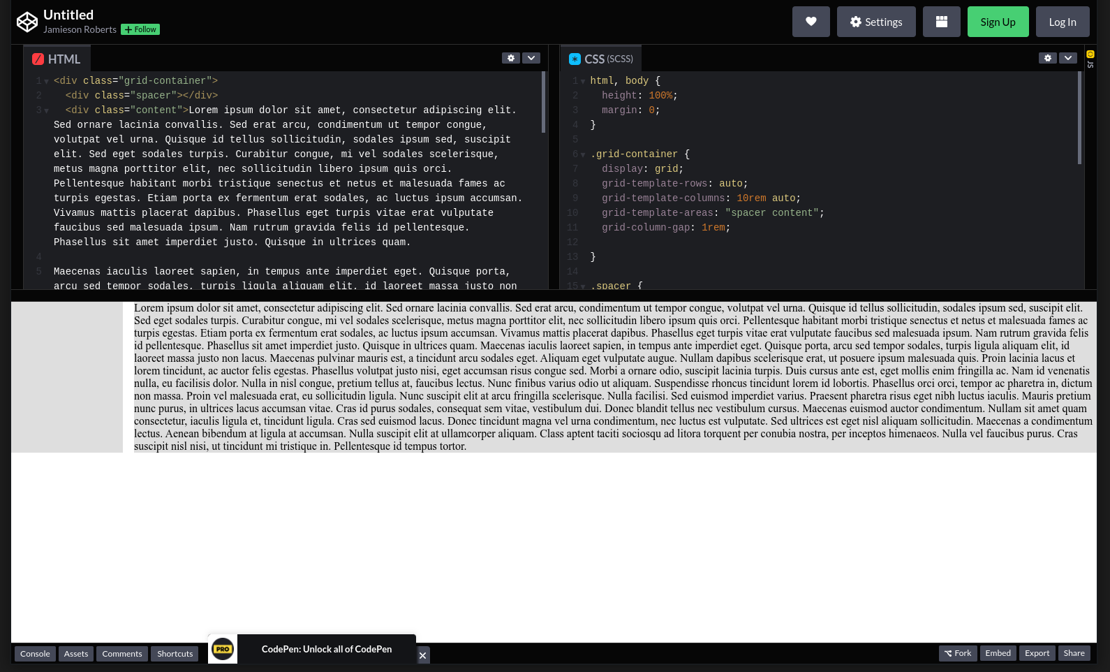
It absolutely doable, but you have to remember about how the page in general will collapse. Grid’s will expand to the size of their container. In the examples you shared above, you are not setting the body and html tags to 100% height. As much as visually they appear to be 100%, their actual rendered height is only going to be the height of your content that pushes down the container.
In the following codepen it does work the way you described it to do so, but that because i’ve accounted for normal browser behaviour on the html and body tag to be 100% of the view area, not just the content height.
In the system I’m looking for both containers are to be responsive. The one containing text should have 100% height and should display all text without overflowing unless the spacer width = 0. Otherwise it should push the text into the spacer direction. Just imagine that 3 sides of the text container (top, bottom and one side) are squeezing text to the other - empty side.
I think I get what you are saying, also apparently I hadn’t saved my last small change around the height thing, so that should now be resolved lol.
So to confirm, basically you want the spacer to be there unless there is too much content and for it to then disappear and the content take over everything?
That’s correct. The tricky thing is to expand the text container so it is not bigger or smaller than the text. So - no text overflowing and no empty space under last paragraph.
This part you are going to have to accept or handle there will be text overflow. Responsive web design means you ahve to account for it somehow, whether its with a scrollable are or a scrollable page for something like mobile, whats your intent in those scenarios?
Thanks @eray. I kinda solved this. Unfortunately it doesn’t work in horizontal direction, only in vertical, but the solution is pretty solid. You can find it here: