Yeah, I already tried hiding the CSS element in uBlock Origin, but the rest of the page didn’t re-flow around it so it just added a giant blank area. Would require something like Stylish.
Yea the site is pretty much unusable on my 1080 portrait monitor of which I use to browse 95% of the time.
Another issue with the site is that if you’re browsing a category like code, you click on a thread, read it and then hit back, you’re sent to the main page, not the category you were in.
A little frustrating for those of us who have little interest in a lot of the content on the forum.
To be honest… Id be happy if that side bar thing just got removed all together.
Yeah I’m not a fan either, it was fine how it was. An option to hide it would be great for those who don’t want it.
times two.
I can’t remember if it’s always been like this, or if this is new. Don’t even know if this is really an issue?
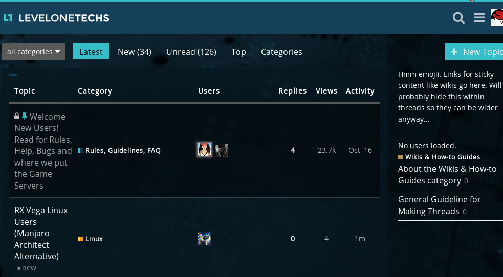
Can you suggest a way we can give more visibility to posts that take a long time to create like wikis and guides? The sidebar won’t be there on mobile and narrow screens, and we are looking for ways to promote the community work that go into those types of posts. They should be longer-lived posts than they are right now and we aren’t sure what to do to call attention to them.
Pin them in appropriate forums. Users can un-pin posts themselves in Discourse (click the little pin icon in the top left), so everybody will see them at first, then have the opportunity to free up that space if they want to.
@marasm: Most likely someone embedded a foreign video or image. Check another post, that shouldn’t happen everywhere.
Maybe using a different shade to highlight them- the current format uses dark/light alternating for each post, perhaps a different color for those guides/wikis.
Or using the pins more as @Ruffalo suggests.
Happens in some threads and seems to always happen at the forum homepage
You can also customize the CSS to add a link to all wikis/FAQs in the top bar frame, to the left of the magnifying glass.
I would actually suggest doing that to link back to https://www.level1techs.com/ as the bar you added is ugly and wastes space. I blocked it in uBlock Origin myself. You can put a Patreon link in there too. I admin a small Discourse forum with around 25k posts/week and am fortunate to have one of the founders as a member, so he helped us out a lot.
Very easy to do: https://meta.discourse.org/t/how-to-add-header-menu-links/29563
@marasm: Yeah they have an insecure embed somewhere on the forum frontpage. It isn’t a security risk.
Okey doke. Disregard.
Wish I had something to contribute regarding the layout and functionality of the front page. A part of me feels like having the default view as “latest” does a sort of disservice to the forum somehow. Makes it feel really small or something. I’ve never used anything but the latest view, so there’s that. Maybe I saw a more conventional view back in the tek days, sort of remember that.
I like the idea of sticking important topics (rules, news) and maybe current/ongoing projects in the title/search/menu header area.
I probably would just make a thread with a basic summary of the post and provide a link back to it. This would be a massive megathread with a new post in the pinned topic or a new topic every couple of months with the latest threads.
Or you do what @Mora suggested and just highlight them a different color
I actually like the change and think that is a good way to attract new people in the forum. I want to ask if it’s possible to include an option in “Preferences>Interface” that will get you the old style for those who don’t like it.
This way this style will be kept and whoever doesn’t like it can change to the previous.
Or ya know.
They just link a onetab with all of the top posts for that week from the forum each L1 news.
I think that “hey check out our forum” doesn’t really sell it to new people to join. Even briefly mentioning some great things that are going on would be a step in the right direction. If you’re gonna dick around for an hour and talk about the news, you might as well mention us.
I can only think of one time that @wendell really ever mentioned it and that was when he thanked @Eden for the great linux news post he used to do (which were awesome btw).
Because the effect is: what is the forum and why should I care. The L1 team still hasn’t really given it the attention it deserves to answer this question to the watching audience.
The problem is that changing the color won’t do much.
The philosophy of the wikis is that the comment replies there are just to contribute to the wikis to be frugal with the readers time. The linked topic function would be for discussion. In the lists we can highlight them as a different color but they will decay rapidly with no replies on the topic itself.
Personally I dislike when I find something (looking at you xdadevelopers ) and I have to read 600 pages of forum thread to know what the hot new thing is and how it works. We can move all that meta out of the meat and potatoes posts. Eventually we may be able to promote and syndicate those posts on the main website.
Unless I’m not understanding what is meant by just color it differently. A top menu item just for wikis is a good idea but the hardworking users on those deserve more promo than that I think.
We might be able to do the sidebar only on the main forum.level1techs.com home page and not the recent page. Users can set their own home page.
https://meta.discourse.org/t/user-preference-for-default-home-page/74171/2
Failing that we can create a theme variation for the users that don’t want it I suppose.
The user preference idea is amazing. It would be even more amazing, if the user was able to determine a time of how old a thread is that they want to see. Because then that would solve the necro problem and then both parties would be happy. If you only want to view threads that had its last post posted within the thread within last 3 months you can. And then threads that have its last comment older then 3 months wont show in their feed. But if you want threads to be in your feed that has its last post in it older then 3 months then you can view them. I most likely poorly explained this idea. Hopefully someone gets the jist of what I said.
And instead of having the sidebar display that we have a wiki section, why not just add WIKI next to Top or Categories.
Touché