Recommended Brightness/Contrast Settings For Best Image Quality On Monitor?

Subject line might be a little lengthy, but it says all. (While I’m not really a photo or video editor or anything like that, I do at least want the image quality to look as good as I can get it. I may not have any of those color calibrator tools for the very fine tuning & I’m no expert at this sort of thing, but I feel like I can get better at it over time from people like you guys who can help & have far more experience. But my main concern is how accurate are my Brightness & Contrast settings that I have & if they actually need a little bit of “tweaking” in order to be better.) With that said, I’ll give you some details.

My display of choice is the Optix MPG27CQ from MSI & it’s connected via DP & also via the included USB cord to my gaming pc. BTW, if you need the info about the monitor, just look it up on MSI’s website & you’ll find it in case anyone needs to know. I should also mention that I used the Color Calibrator built into Windows & went thru the process BEFORE I actually looked over my monitor settings. Included below I will have my current monitor settings as they are along with a screenshot I took earlier to show you how the colors look & all that.

Current Monitor Display Settings:
Under the Gaming section, the Game Mode is set to User & the Black Tuner is set to 10/20.

In the Professional section, the Pro Mode is also set to User & Image Enhancement is turned off.

As for the Image section, Brightness is set to 80/100, Contrast is set to 70/100, Sharpness is off, & Color Temperature is set to Normal.

As for my room itself where the pc resides, the room itself is a bit small but I keep it bright using my ceiling fan which has a few light sockets. I only populate 2 of the 3 sockets with 72W 120V light bulbs.

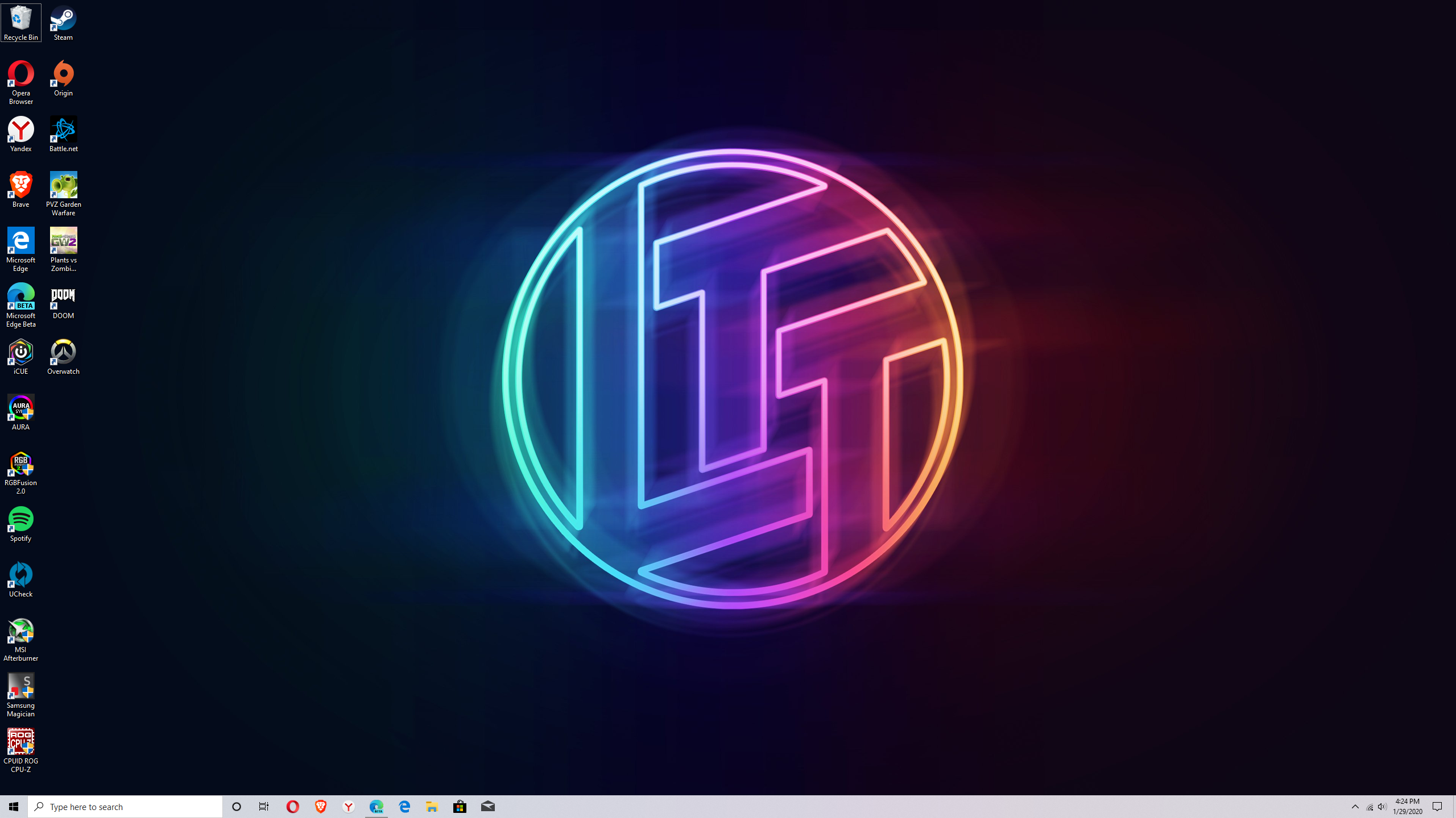
Now I know that not everyone’s eyes are the same & what may work for 1 person may not work for another, but I still would highly appreciate your thoughts, input, advice comments, suggestions, & tips if there’s anything you think/believe could use improving. (As far as my monitor settings go.) The screenshot is included as a point of reference so you can help properly & as you can tell, I’m a LTT fanboy. :wink:

If any of you happen to need more details or have any questions for me, just go ahead, ask & I’ll get back to you in a flash! Thanks to anyone who might be able to help! :slight_smile:

http://www.lagom.nl/lcd-test/

Good resource for test patterns, as well as explaining the meanings of the various settings.

Brightness is black level, contrast is white level. Long story short, set them as low/high (respectively) as possible without distortion (i.e. clipping). Set the backlight to whatever’s comfortable for your eyes, or use the contrast control if there’s no backlight option.

Color and gamma are impossible to calibrate precisely by eye, at least without a reference to match against. I usually rely on presets (look for an “sRGB” or “warm” preset, usually). If a display review site (Tom’s Hardware, RTINGS, etc) has reviewed your particular monitor, you can copy their settings and get pretty close to correct.

I recommend turning off any post-processing effects. Sharpening, image enhancement, anything with a weird name that’s only on your particular brand of monitors. Google helps in identifying these. Some monitors have a “game mode” that disables postproc stuff, but other monitors have a “game mode” that enables extra postproc. It’s usually pretty easy to tell which it is.

Well, I do remember that I did look up reviews for the monitor before I actually bought it. I have no doubts in my mind whatsoever that it’s bad; in fact, I think it’s pretty good for a VA panel. And just last night I stumbled upon the very website you recommended. The only problem I faced was I’m not sure if the method they recommend would work just the same for LED-type of displays since this is NOT LCD as stated in the website.

However, the way you worded your response kind of confused me. When setting your brightness & contrast levels on your monitor, is 1 supposed to be higher than the other or are they both supposed to be about the same level…? I would appreciate it if you could explain further so I’ll understand or just try to clarify for me. :slight_smile:

As far as I know color performance on any LCD/LED/VA panel is not influenced by the amount of backlight shining through. If you’re not doing any professional work but just setting up the monitor for your enojoyment just fiddle with the settings until you find what works for you.
If you want the best possible settings you need a device for color calibration that creates a profile for your specific panel (much like silicon lottery every panel has slight variations in performance).

Well, I have tried tweaking the settings on my own, but I’m not really sure if I made them any better or not compared to out-of-the-box. Lol And I’m pretty darn sure the backlight on this model can’t be adjusted anyway. But I would like someone’s input on what the brightness & contrast levels should be like for great image/picture quality. (I would actually get 1 of those tools for proper color calibration if I was doing anything else, but that’s beside the point for this topic; I just want to know if my current settings are good enough or if they need further “tweaking”.) Besides, I’m just wanting image quality to be as good as I can get it since I’m a perfectionist. :man_shrugging:

But bear in mind as well- I’m no expert at this being’s as it’s my 1st desktop machine, so…

LED is a type of backlight, used universally these days (replaced fluorescent tubes). IPS, TN, and VA are all types of LCD displays, any of which may use an LED backlight. A display marketed as an “LED display” is just an LCD with an LED backlight. OLED is different, but the lagom test images work on any monitor. Some tests might just be irrelevant (like VGA clock/phase).

Brightness is how dark the screen can get. It controls how dark the color “black” is. Contrast controls how bright “white” is. For the best image quality, you want darker blacks and brighter whites (aka a higher contrast ratio). But the LCD panel has limits; if you lower brightness too much, the dark grays will all be “crushed” to black, which is bad. Same for contrast, but with light colors. Again, see the lagom test patterns.

The numbers and scales are arbitrary, and vary from one monitor to another, so we can’t tell you what numbers to use unless we have your exact monitor. If in doubt, stick with a preset that looks roughly correct.

Hm. Totally understandable now that it makes perfect sense. I will definitely keep in mind what you told me. And thanks for the replies! :smiley:

1 Like