New Steam Storefront

So steam has a new storefront and they siomehow managed to make it worse. Here are some lovely examples:

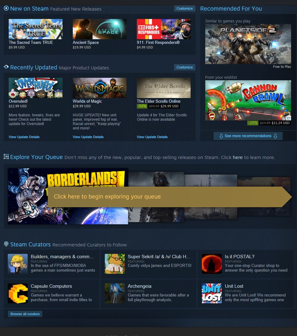
You will notice that this junk which has nothing to do with buying anything takes up the entire viewable area of a maximized steam window at a resolution of 1920x1200. The majority of people use 1920x1080 so this would be way worse for them!

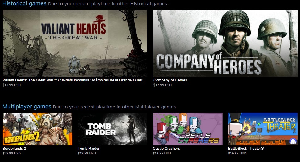
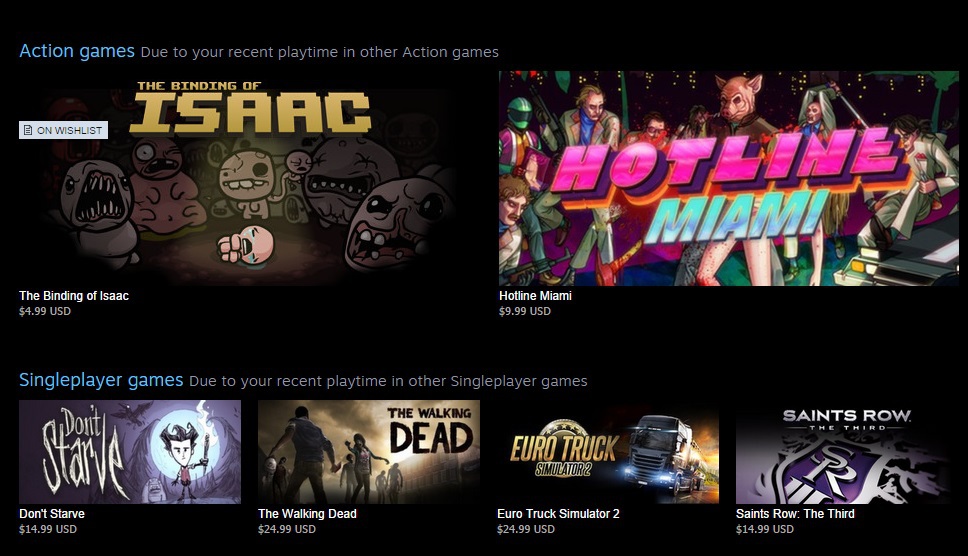
They also included these suggestions as part of their new bloat, it takes the game genres you have played and recomends you what is assumably somewhat popular games in that genre. Please note how awfull these recomendations are, I am not saying those games are bad games (although they probably all are).

I am saying that I would not make recommendations like that because those genres, those games, they should not be recomended like that. Those are not action games for instance, and the game recomendations are too diverse.


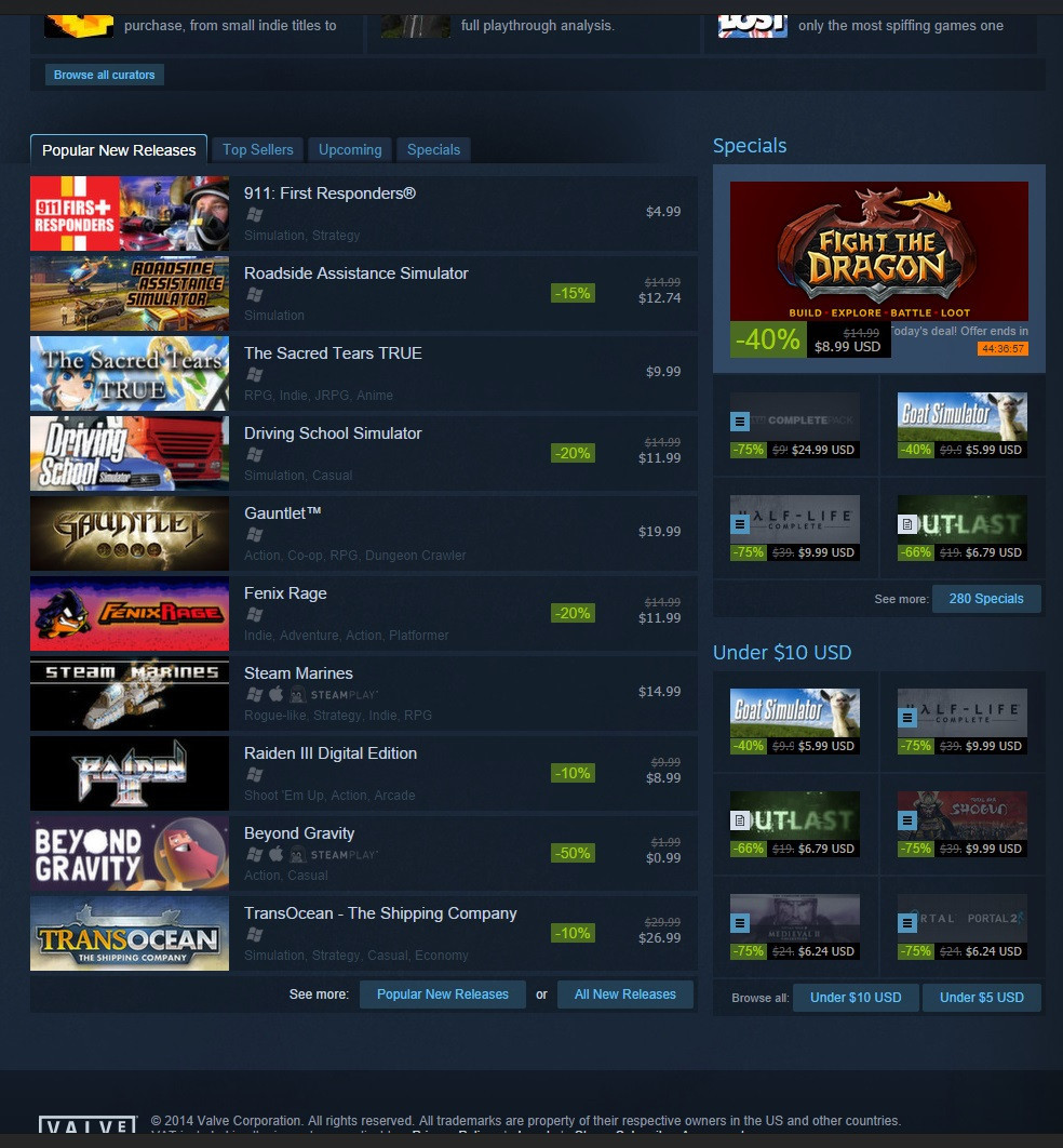
Very little of the actual page has anything to do with the purchasing of games, this is bassically it, and that nice large featured window at the top, they also failed to add a filter in the 'new releases' tab to make it only display actual new releases (which IMO was the only thing which didn't work in the storefront, apart from adding games you already have to watchlists!).

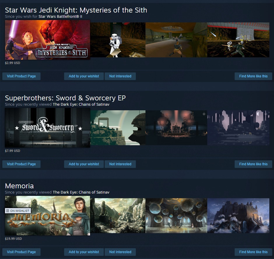
Also on the same page, usefull recomendations based on any game you have every clicked on the storefront or put in your wishlist!

Please look carefully at all the picture above, you will notice there is a kind of splotchy look to the picture, when I saw it I started cleaning my screen, it is actually just the 'artistic look' of the store background. Yes even the store background is specifically designed to look like poop. Also there is notable banding on the sides of the storefront, again presumably artistic license.

Whatever happened, to going to the genre page for recomendations for games in that genre, or looking up tags, or even just a system where you click on a game and they have 'people who viewed this also viewed/purchased x'. There was even that god-damned recomended for me tab we had, which was always shit....

TLDR: Very poorly designed storefront with minimal space being used for the actual sale of games, with 90% of space being used for things like helpfull suggestions on games based on genres you have played, games you have played, games you have looked at etc..etc.. Also deliberately grainy and splotchy images that make it look like something has damaged your screen....

I hate the new redesign, why fuck with something that isnt broken?

You realize this redesign is an attempt to fix the quality control issue that have been plaguing steam recently, right? All of this curator pushing will die down in a few weeks and you will be seeing less of the curator stuff. Or do you like seeing countless cash in early access games and mobile ports all over the front page?

If they cared about quality they would impose higher standards of what qualifies to be on the steam store, alot of publishers have been dumping their entire back catalouge on steam, they even gloat that some 1,500 out of 3,500 or something games on steam have been released in the last year. Most of those games are utter tosh, and they just serve to clutter the place up and make it harder to get to actual games.

Now this redesigned steam store, which devotes even less space to the sale of games, and which adds even more clutter by integrating stuff which is completely irrelevant insofar as purchasing games goes, does nothing to address this issue, an issue which as totalbiscuit pointed out, could have easily been resolved by the inclusion of a tickbox that said 'show only new release games', just as there was a tickbox that said 'do not show dlc'.

These recommendations are not useful FYI, they recommend you basically any game based on any category, if you wanted to see what games were remotely popular within any given genre, there was always genre specific store-fronts, then we got game tags. From a design perspective that always should have been a separate page/tab and it was.


**EDIT** If they wanted to improve the storefront they could have given us more parameters to filter by (i.e. console ports, drm, casuals, age recomendations, you name it), they could have made the lists scroll, they could have put in-screen popups with more information when you mouse over the game. They could have put little tiny links which you click and a trailer pops, up and plays a video about the game, or little symbols next to the game on the store-front which denotes if it is single player or multilayer/windows or mac or linux or all of them.

They could have added tabs. They could have redesigned the storefront to work better with widescreen displays (which everyone has). They didn't, they decided to integrate the recomended game features from every genre tab, and the personalized ones, and put it on the same page you go to, to buy games **EDIT** 

As long as I know what's on sale, and can search for a specific game I'm interested in (or browse a genre), I don't care.  I really don't use the steam storefront for anything else, so the content doesn't concern me much.  As far as I can tell, the storefront still has everything it used to, they just added Recommended, Updated Games, Queue and Steam Curators.  I guess it adds some bloat, but since I don't use the storefront to tell me about games anyway, I'm unaffected.

I am of two minds with this.

On one hand I don't like the suggestions, they are nto games I play nor like the idea off. They should go away. They have added extra levels of click t the menus, instead of the daily/weekly deals showing a cycle of games now it tells you to click through, an extra step that is not welcome. same for the New/Specials/Coming Soon and Whatever the fourth one was. You have to click in now to see them rather than displaying a few.

But on the other hand, Game pages when you find one you like are much better laid out. The review system actually comes into play now with overall feelings. They clearly state in a different colour if the game has third party DRM, a very welcome change. 

The over all for me is better/indifferent, I don't mind the blue. But I wish they had put 3 more seconds into the background, the colour banding is horrific. 

I checked the store front more, unless you only view the first 10 games in each of the tabs (new, featured, special, etc..etc..) then you can't use the front page of the storefront for that, you have to go to another page (which just has a horribly long list), in otherwords its useless.

As zibob said though, the other pages of the store, i.e. the genre pages are better IMHO. They just destroyed the front page though, to the point that you need to use a 3rd party brower with element/ad-blocking  functionality to make it usable. Its like Windows 8 all over again... IMHO it wouldn't be so bad if they had an option to hide the bloat, and browse from the front page.

I would just set a bookmark or two and forget the home page completely.

Some people like it, some people don't. It's best to just deal with something small like this until they change it again.

And if enough people complain about it to them, i'm sure they will change it.

This is the only thing that makes me mad. I'm used to Friends being at the bottom and now I keep hitting Big Picture.

Thats what I planned to do, in a 3rd party browser that lets me remove elements from webpages. Its pretty stupid that I have to do that to be honest, will probably miss out on a lot of sales because of it IMHO, just need to make sure every game I want is on wishlist so I get email Notification.

There are also 3rd party stores you can get steam keys from. I complained on their official thread regarding the changes, ironically the first post which I think was made by a staff member very carefully described how you could filter the crap out on a 3rd party browser, might send them an email too explaining how this degradation of the store experience will negatively impact my tendency to buy games there.

IMHO this is about the massive influx of new active users, there is over 100M active users now on steam, I remember last year it was something like 40M, and it was big news when it eclipsed xbox live users, now its probably exceeded all console users or something.