Need some help with a design idea

Hey.
Well, i have some ideas for some stuff about the youtube channel thumbnails, and what skills i have prove to be useless...
The idea is to have a unified base visual for all video thumbnails, something like this:


Each series have it's own thumbnail, but they look similar, so at first glance you can tell what channel it is, what series it is and what it is about. So i wanted to do something like this. Way simpler, not really an entire painting. Just a simple shape.
I need something like this:

that is like the best i can do, and it's horrible.
I wanted to do it with some color gradient or something on the dark blue part, paint doesn't do that...
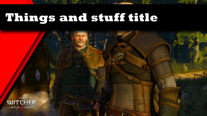
I wanted to make some other more aggressive designs, straight lines, angles, no curves... Red color scheme to fit the aggressive style... Ended up with this:

I wanted to do some extra stuff, weird shapes, angles, etc, but... yeah... Wanted to have a few different designs, swirling purple one, one with traces and stuff, that looks like a PCB and the bar at the top to be like a long chip or something... I can't even do the flat colors...
Really need help with that guyz... I suck at visual design. If i can't i better ask for help. I mean everything else would be better, except my older designs. Oh, God, you don't want to see those...

I don't mind having a signature in the corner or something, i don't mind crediting whoever helps, but i can't afford to pay money for it.

using these shapes as the background which.. youd put a number/title infront of?

i mean the example you linked is just random colors with slightly varying stripes basically..

so dont see why you're red/blue wouldnt work similarly if you put some shiz infront of that or behind or whatever..

maybe make an actual example thumbnail might help decide what to do with this 'layer'?

say the red was for gamining stuff, you could put a screenshot of the game behind the red, a title being the game name, a segment number/review whatever it is.

could always mess with transparency etc

That's the basic idea... I just want it a bit cleaner, a bit better looking, a bit less crap...
The red was supposed to be gaming, the blue was design series i am working on, the green PCB, that i will never make was suppose to be about random hardware videos i do from time to time...

Because my skills are awful and I am asking for someone to actually make a couple of those for me. As i said above, to make something, that doesn't look like crap...
I want it simple, as you said, just a shape with a stripe on top for the title. That's the idea.

idk i cant art for jack usually XD.

just meant might be easier to tell the 'worthyness' if it was more complete.

Sexy.

Yeah, something like that... Just ... With better red thingie... But that is the basic idea. If the image was better, i would rather not have the red layer transparent...

idk lol was just an example :p did 25% for the stripe 50 for the rest, could bump to 0, 25% for the dark or 0 for both(felt looked weird cause covering up so much that in that particular case maybe would be better to recenter the image or something so you could see the deathclaw better

but either way -shrugs- think looks fine bunch people dont even have gameplay anything in the thumbnail lol

Well, the blue one is honestly OK... I mean i would like to have some gradient or something on it, but the red one, can't even make the shape properly, without hiding like half the screen.

Well, i want to kinda make something out of that if possible, so i want not to be like most people...

< mean say the deathclaw image i used, was 1920x1080 so totally could have moved it over instead of scaling the layer, so that the deathclaws torso/head was in full view.

OK, since the blue design was the only design i actually like from all my attempts, i decided to try and just change the color...
It's... Meh... But it's way way better than the old red design...

All other designs i tried was both ugly as hell and was covering too much of the screen...

Still, if anyone have any ideas about what i am trying to do here - i am still open to suggestions.

Use paint.net, it's free and there are plenty of plugins available if the stock tools/effects aren't what you need.
http://www.getpaint.net/index.html

Play around and have fun.

1 Like

here's a really simple shape. IMO you don't want to cover up the thumbnail too much, but you want the identifier shape to stand out enough for folks to see it.

here's 2 mock-ups:

2 Likes

Yup, that's the main drawback of my own designs... I really do not want to cover the image too much.
However, i want the stripe, so i can use it as title ... stripe...
I can take out a stripe in-between the two shapes...
Yeah, that's a nice idea :) Thank you :)

could put a little transparent bar across the frame for the title . . .

I don't really want any transparency if I must be completely honest.

well there's about 1 meeellion ways you could do it :D


I just think a bit of transparency is a nice look.

1 Like

OK, the extra layers you added here are giving me some extra ideas. I will play around with them ideas and try to figure out this thing. The videos i want to use those for are almost ready and i don't want to start uploading without this done. I will try and make something tomorrow and check out Paint.net again... Last time i tried it it was not a pleasant experience for me. Hope my brain have matured since then.
Now is 3am and i need to go to bed...

1 Like

I like how i started installing paint.net with 7,52GB free on the C deive, and finished installing with 7,8GB free...
PS:
I am looking at this and i don't understand anything...
I try to color, the shape goes away, the gradient is pain in the lower back, 5 clicks to draw a circle...
Visual design is not for me...

This is the kind of stuff I am going to be needing to think about that I am now doing live streaming and thus also more interested in tying in a YouTube channel and maybe my website. As for being able to help you I have no ideas off the top of my head but I appreciate this thread here as it will definitely help me and actually my son at some point. Also I liked seeing Jim Sterling stuff in the original post. When I think of him he is one of the things that has made it possible for me to stay somewhat sane over the last year or more. Thank God for Jim Sterling ... son!

You missed a word there, buddy... I think it had F somewhere in it...
Anyways, I'm a huge Jim Sterling fan. Not always agreeing with him, but that is not the important part.

It's basically branding... At the moment someone looks at the thumbnail with that border they think about that person.
In the case of Jim Sterling - we kinda reached a point, where when we see a game on steam - we think of Jim Sterling. And I'm kinda fine with that...
I think I will just color code it...
I mean I am crazily bad with visual design, so I think I will just use the different colors for different series. May have to rework the channel logo as well, but that will be layer on.

1 Like