I’m currently a web developer for those of you that didn’t already know that, I handle the full stack, I’ve even begun to get involved with some stuff that may be on the borderline of networking. Anyway, I’ve begun to think heavily about user experience, I don’t know why, I feel pretty happy with my abilities to program complex/advanced applications in an efficient and timely manner. I’ve also begun to feel rather satisfied with my abilities to program an application that’s highly performance friendly, but I feel that my abilities to create an application that’s great from a UX perspective could improve rather drastically.
Examples of Previous UX Work
When it comes to improving the UX side of things, I usually try to think of a car, I try to abstract the user away from the mechanics of it all, and just let them use a simple interface with limited input, the system that I’ve developed doing the rest. An example that I’m fond of is a rather tedious form, I believe that it utilises ~ 100 input elements, however, due to funky CSS & JS I’ve made it seem like there’s substantially less inputs.
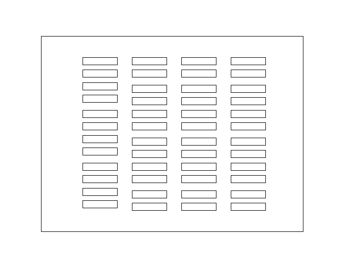
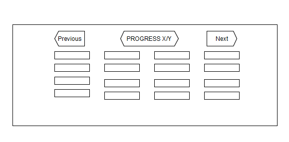
Here’s n example of the form in it’s ‘naked’ format:
Here’s something like what I’ve ‘compressed’ it down to:
Both forms have the exact same number of inputs, but I’ve encapsulated some inputs so that there’s 1 UI element that interacts with 2 form input fields. I’ve also made it so that you can progress through the form in steps, rather than intimidate the user with a huge amount of inputs on one screen.
Problem
I feel that there’s a rather large amount that I need to learn in terms of improving UX, I feel like I need to be more creative in my abilities to apply a better and more efficient and all round more enjoyable UI.
So…
Do you have any recommendations in terms of how I can improve my UI & UX design abilities?
Do you know of any excellent learning sources?
Do you know of any exceptional example of applications that do and handle large amounts of data, but the UI is very minimal and simplistic?
Any further recommendations would be greatly appreciated.
Simplicity is key, minimize the potential for confusion, always provide indication of progress, always make it clear and easy to go back in time and undo/fixup.
I would also suggest Alan Cooper. Read some of his stuff, and think about it.
If I understand his position right, it is that ux has become so perverted by people that misunderstand it as to almost be meaningless. He sees ux as a sort of zen. Like a pure truth. From his point of view UX is like math. Math is just trueisms.
For him when you say “ux designer” it would be like saying you are a “Physics Designer” or “Physicist Experience Engineer” ok cool are you a member of the Q continuum altering the cosmological constant? no? ok, then you are just discovering the Physics that was already there. Not making new physics…
People expect to be able to do X. The success of the iphone came not because someone designed a great ux, replacing the laughably ridiculous stylus-based uis of the day, but because there can be no other interface that makes sense.
“ux design” is just discovering the truth of the required functionality.
it’s a neat way to think about stuff. Fred Brooks also wrote antiseptically on the design of design which I found help me relate tremendously to creative types (not exactly-- long story) and improve my own thought process when putting together how stuff should work.
To me, UX design is simple, and you are actually already on the right track. Take what ever the raw page should look like, and remove as much of it as possible. Once you have taken so much out that taking even one more feature out would break the functionality of the website, then start combining any features that are left.
I am kind of hypocritical when it comes to UX because I have a rule and an idea that conflict.
My rule is that your job as a UX designer is done when you literally can’t change a single thing without altering the core functionality. And my idea/feeling is that you also shouldn’t be afraid to have 1 or 2 extraneous features left kicking around for power users.
Once you are done cleaning up the page, then worry about making things intuitive. THEN worry about making it pretty.
That’s the kinda approach I often try to take, I try to treat an form of interface or application in a manner where I just assume that the users are basically brain dead or they know nothing/very little about the application in hand. I often fin learning about how the elderly to be an incredible way to measure simplicity.
Generically/stereo-typically speaking, in my part of the world, the elderly tend to be incredibly technologically illiterate, I know of some people that can’t make sense of an I/O icon/symbol, as an example. I genuinely know of people who can’t turn on a P.C. without assistance, and I find watching this set of users (without assistance) to be incredible for learning how to dumb things down even more.
I can’t say I have, but I’ll be sure to take a peak!
Reading your summary, that sounds like an incredibly interesting approach. I can’t say I’ve ever really thought about it like that prior to this very moment in time.
When you say helping you relate to creative types, this sounds like something I need more so than want, I currently work within a very unusual place, with a very unusual set of tools. I’m unsure if you’ve read previous posts of mine, but in my current role I’m limited to the front end, which is insanely annoying for me. But… I’m often asked if I can implement back end like features and functionality, and I’ve tried to find tools online that can simulate this through JavaScript, but as I couldn’t find any, I decided to build my own. I mean I’ve build an SQL engine, included my own template engine, you name it… Etc…
I’m basically the go to developer, but I seem to work with a bunch of designers that know HTML, CSS and limited JavaScript, and I often find that there’s some confusion with our communication. Sometimes it may be down to more sophisticated terminology or simply down to a different way of thinking all together, but the number of times I’ve been asked to do something, and I’ve done what they’ve asked, only there’s been about 101 micro changes, due to the poor level of communication.
I’ve personally made a huge effort recently to explain computational and/or software engineering concepts in such a simplistic way that anyone, from any background can actually make some form of sense of what I’m saying, provided they have a fair grasp on the English language. Sometimes I think I’d make a great teacher when I come up with creative ways of explaining somewhat more complex problems to understand.
That’s exactly what I try to do, every time! … With the example I’ve mentioned, I’ve also done some sophisticated caching, both front end and back end, obviously the user is totally oblivious to that, but it improves the performance of the over all application quite dramatically.
That sounds a lot like my problem, take my personal website as an example, I’m not sure if this is a good thing to have or not, but I’ve implemented a feature that basically simulates flux onto my very, very basic web page/site. I personally think it’s good on one hand as it improves the ergonomics of my website for people who may view the website at night or very early hours of the morning. However, I’m not sure if it’s at all necessary, and I’m not entirely sure what others may think of it, but hey ho! - I’m willing to experiment.
Thankfully, due to the environment I work in, that’s always the last of my worries!
Summary
Would you all agree that this is a somewhat accurate and precise summary of the approach that should be taken when it comes to improving a user’s experience of any interface/application:
Reliability & Security
1.5. Performance (Somewhere between 1 & 2 in my eyes).
Minimalism & Simplicity
Look & Feel
Attraction/Pretty Factor
Security?
The only reason why I’ve placed security and reliability at the top is down to a personal experience of my own that I encountered yesterday if anything, I was working with an API, one which handles and stores a lot of very sensitive user data. However, I actually found an incredible security flaw, I mean it’s so huge and so obvious, I can’t comprehend how this company that’s running this API is as successful as they are. I’ve had to do some very unusual stuff to basically patch over their security flaw, this is where the back end feature that I mentioned above comes into play.
You may be wondering how I do some actual back end stuff when the website that I work on, on a day to day basis has, in theory, no back end. Well it’s simple, I send the data through to a totally different server, then I’ve written some PHP to interact with the API I’m mentioning. I’ve done as much as I possibly can to protect user data, but even then, it’s not entirely secure, yesterday I had a very stressful day, due to my major concerns with how the web application works… I’ve done all that I can do to patch over the security flaw that I discovered… Basically if you input no parameters to this API, it brings back every user’s data on the DB, I still can’t believe how ridiculous this flaw is, especially with the new European data protection laws.
Since I’ve started my job here, I’ve emphasised to my line manager and the managing director how we really need to consider developing our own back end, so we can securely handle data, and do everything that the website currently does in a much more timely manner (it’s insanely slow) and finally, provided we did have our own back end, we could have more sophisticated components on our website, even something as basic as allowing users to log in/sign up and have an account of their own, etc. But, with every attempt to emphasise how terrible our current back end is, I’ve had no luck in convincing them, they have the attitude of ‘if it ain’t broke, don’t fix it’, only yesterday I’ve proven to them at last that it is broken, very broken… I mean having to make these weird hacks/patches/work-around’s, etc, it sure has made my way of thinking about how to solve a problem grow beyond my wildest of imagination, but God damn, they get old, and trust me, they get old fast, very fast.
Kudos to you for thinking of the user experience, this is not something only the designers should do.
UX is on the right track when you rearrange in a meaningful way, the same amount of elements, in a form.
However, it can exponentially improve when you also consider if you can automate fields, remove some or even reconsider if a form is the right approach in the first place for the goals the user has in that screen.
I suggest you show the mockup to several colleagues or friends and see if they know what to do with the form, bonus points if the guy/gal sees the screen for the first time in his life, and he or she can actually figure out how to get from a to b with minimal supervision. This can be a quick 5 minutes exercise.
Good luck.
Source: UX since the first Iphone came out.
P.S. if serious about studying UX, consider this a +1 to the quality advice before this post on what to read and also add “Don’t make me think” to the reading list.
Well yeah, I mean to be a good software/back end/full stack developer, even though you won’t be doing 100% UI stuff, you still need to take into account how the user may interact with your application.
I.E. It could be as simple as how you want to implement authentication/authorization with your API, you may want to require a basic authentication approach, custom headers, http post method… Etc… If the end user isn’t 100% aware, then unless they’ve had some experience with that kidna development before, then they’re not gonna be able to figure it out with ease and I’ve witnessed this myself in real life. One of the ‘webmasters’ that I used to work with, knew basic front end stuff, wanted to make some JS to interact with some API but didn’t know what they were doing wrong with the log in details, they tried a HTTP post method, when the end point to log in required a HTTP post method with json submitted, in addition to a query parameter, 2 headers and a cookie on top of things, I’m not sure why they included so much ‘validation’ for that, it wasn’t exactly sensitive data…
As for the approach, I totally agree, at the time when I was making that web form, I was in an unusual position… Essentially, I had no access to a backend, so it made automating things a little awkward, as the ability to retrieve data and submit data, etc… It was an odd one… I just went with the form approach because the end point required a http post method, with json data… Easy enough… Although I’m sure that there is a way to make it better, but either way the end result wasn’t actually an implementation that I agreed with at all, my line manager said that he wanted everything to be visible all at once, I still think that’s a terrible idea just because it means that there’s a lod of data to read through as soon as the form is loaded!
Whilst UX isn’t my main focus at the moment, it will be at some point, at the moment I’m currently looking into making 100% restul web services, I mean 0 session’s… Surprisingly easy tbh… Plus I’m starting to love the approach because it means that you can separate your back end from your front end in a very nice and clean manner.
Final statement… I’m glad that you’re encouraging others to focus more on UX, because as I’ve stated UX isn’t all about the UI, it’s about how the user interacts with everything, whether you’re developing an API for other websites/services to make use of or it’s a very basic web app, I mean you can have a beautiful looking website as an example, but the UX is terrible because they’ve tried some very alternative approaches to basic UI components, I remember finding one website, at first I genuinely didn’t know wtf was going on with the navigation, I just played around with it for a second or two… Soon figured it out… You had to drag a HTML element on top of a link in order for it to work, whereas natural instinct… Click on the link, something happens…
If you want an out-of-the-box, front-end design guideline, material design has you covered. Doesn’t cover every aspect of UX, but will at least provide you with detailed UI guidelines so you don’t have to spend time hashing out your own.
 … With the example I’ve mentioned, I’ve also done some sophisticated caching, both front end and back end, obviously the user is totally oblivious to that, but it improves the performance of the over all application quite dramatically.

