How about a set of scales, with "FAKE NEWS" stacked on one side, and "SKEPTICAL" "EDUCATED" stacked on the other?
1 Like
1] Ideally, I want the relevance of the saying to be as short [time wise] as possible. If the problem is solved then the shirt is irrelevant = good.
2] Using pictures helps. I liked* the scales idea. Perhaps an outline of the thinking man sculpture on one side and some ideagram for "fake news" on the other.
*The scales might give an idea that there is weight to "fake news".
Hi,
I don't understand it 100% would it be possible to make photo of a sketch what you mean?
That would really help.
Sounds interesting I will think about this idea too.
Important seams to me to get across what Wendell said.
That to fix Fake News we don't need another scary ministry that eats parts of our freedom. That we need bright people to deal with misinformation instead.
When you have some great ideas of words to put on both sides, to get that across I am happy to hear.
To be honest, to make a great Shirt is harder than I thought. Because it has to be snappy enough to get the idea across in 3 seconds in an optimal scenario (when someone walks by).
Or it has to look interesting enough, to look for another 3 seconds and then get the idea.
And sorry that I deleted my first reply, was the same text but at the wrong place. ^^
To 1)
This manipulation of Media, and the attempt of governments/lobbys/ideologies to get the power over information is the struggle every democracy has to face I think. Now a new word is created "Fake News" but I would like to make a shirt that is still relevant, when a new word is created in a new attempt to shut down ideas that are different. That is why I don't want to relay on buzzwords like "Fake News" if possible.
2)
I also think we need something more graphic, maybe I can even do something visual with the text itself to make it more understanding and catchy.
why not a picture y/x | means y= trumo with giant dildos and goldteeth x= trump buys 10% share of pornhub.com
over the picture its FAKE NEWS x PURE INFORMATION
isnt nearly in the realm of the original thought or text, but the best i could come up wiht graphic.
also: why not just a qoute of @wendell @ryan @kreestuh that is "typical" wendell, ryan and krestuh.
"Quote" - Wendell, Level1Techs 2017
maybe with the logo aswell.
ideas=empty
Thx for all the tipps and ideas!
It got me thinking a lot. :)
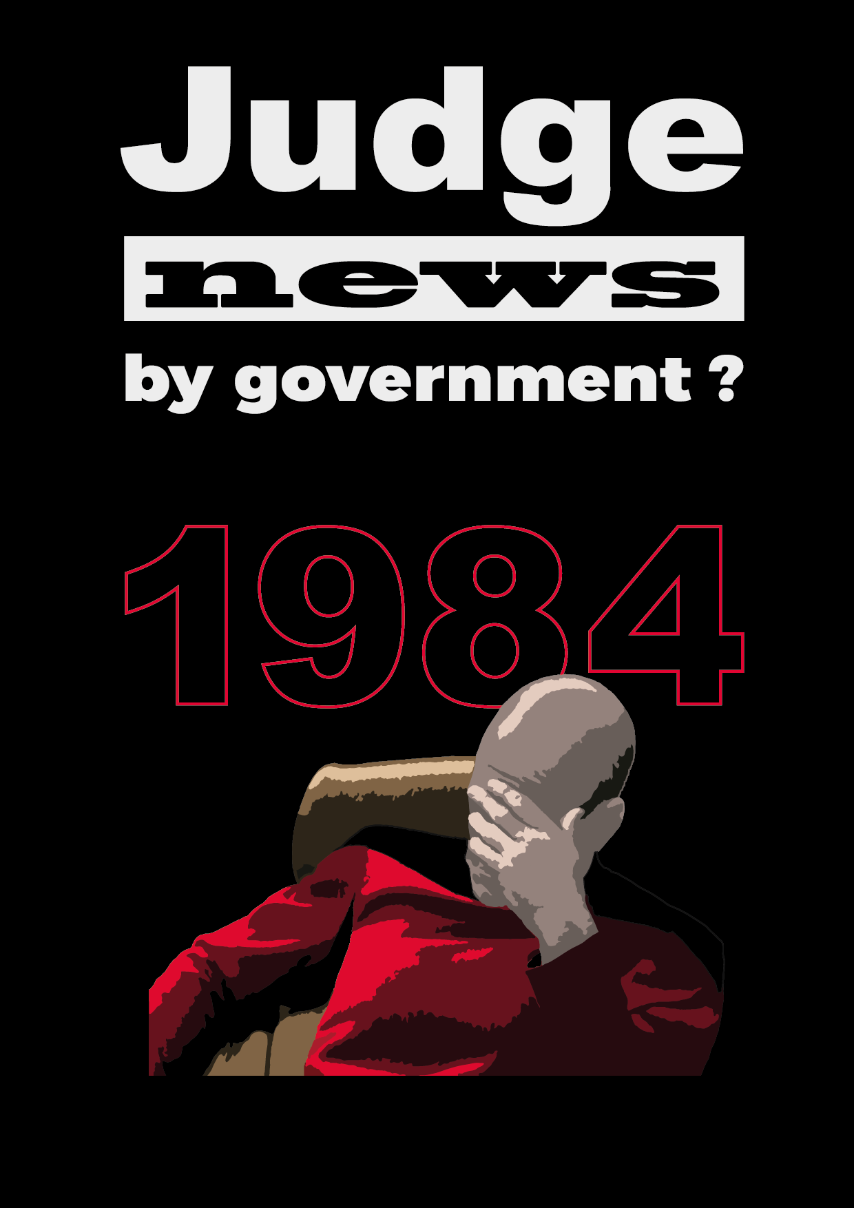
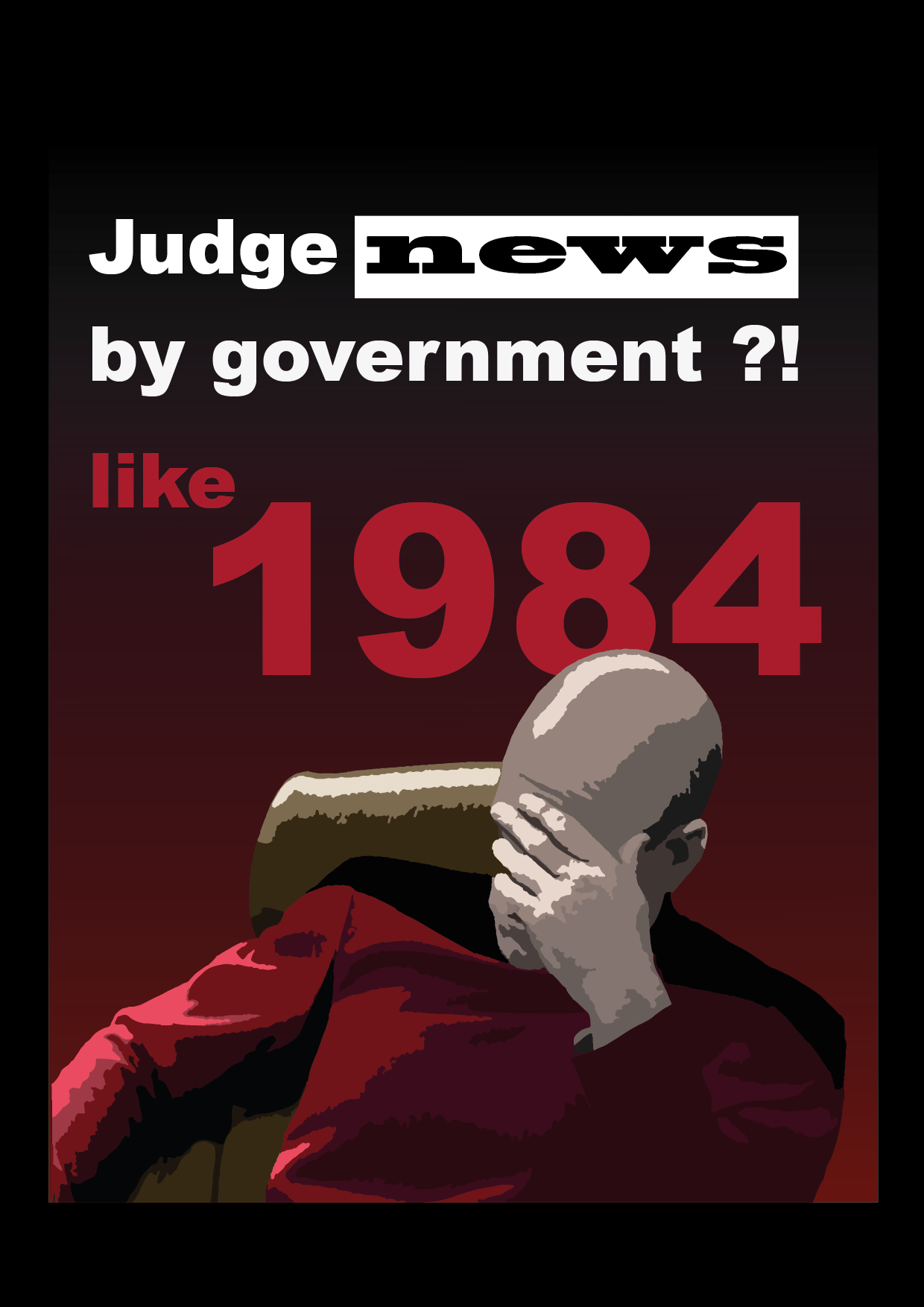
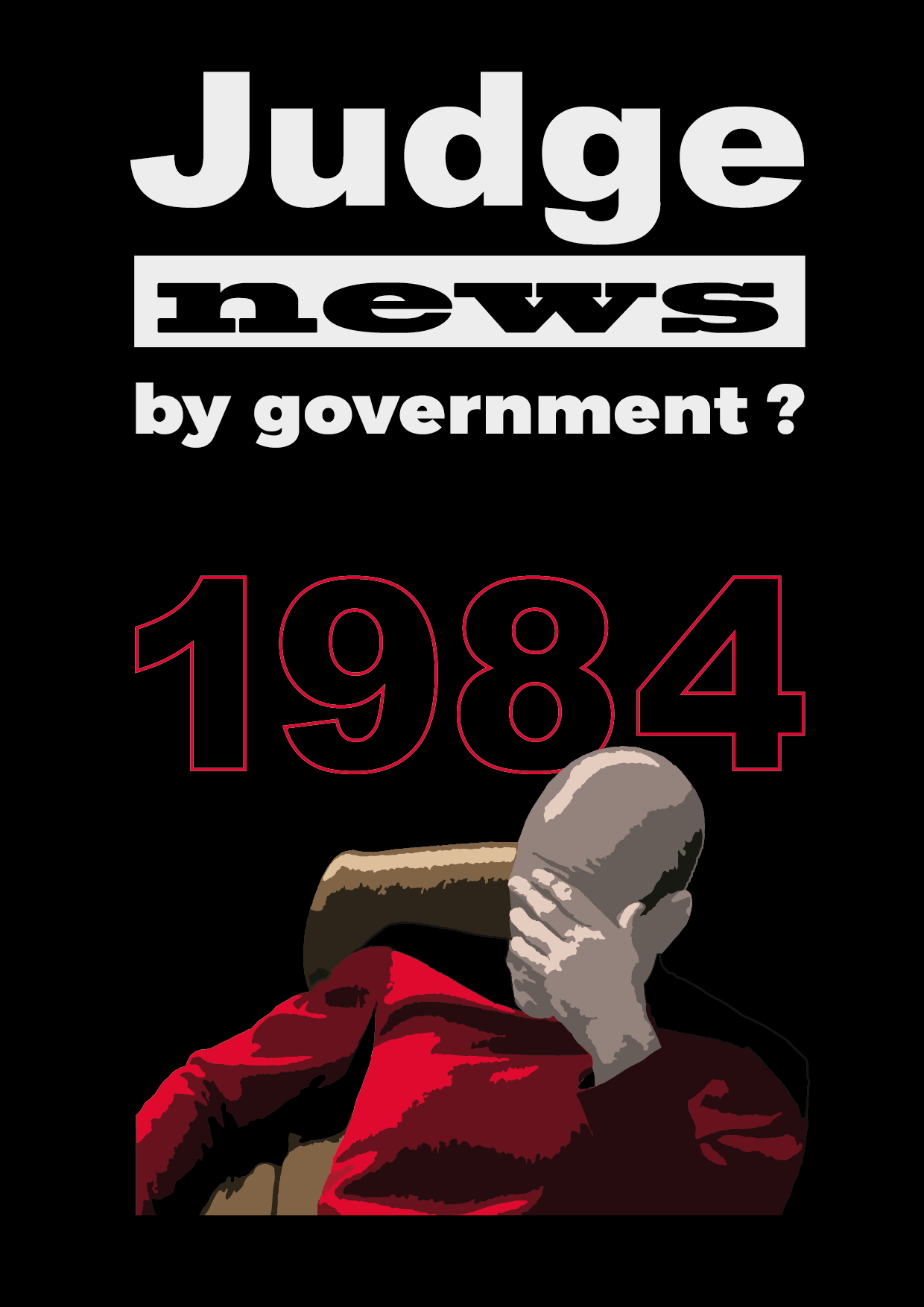
I got this idea, to communicate the critical thinking part by Picard, because the words are to long.
also I found a way to let the buzzword "Fake News" out.
And I use "1984" to communicate what will happen when the state can break the freedom of the press.
I am much more happy with this now, what are you guys think?
1 Like
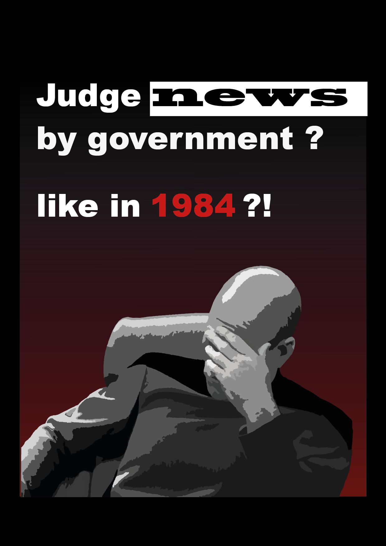
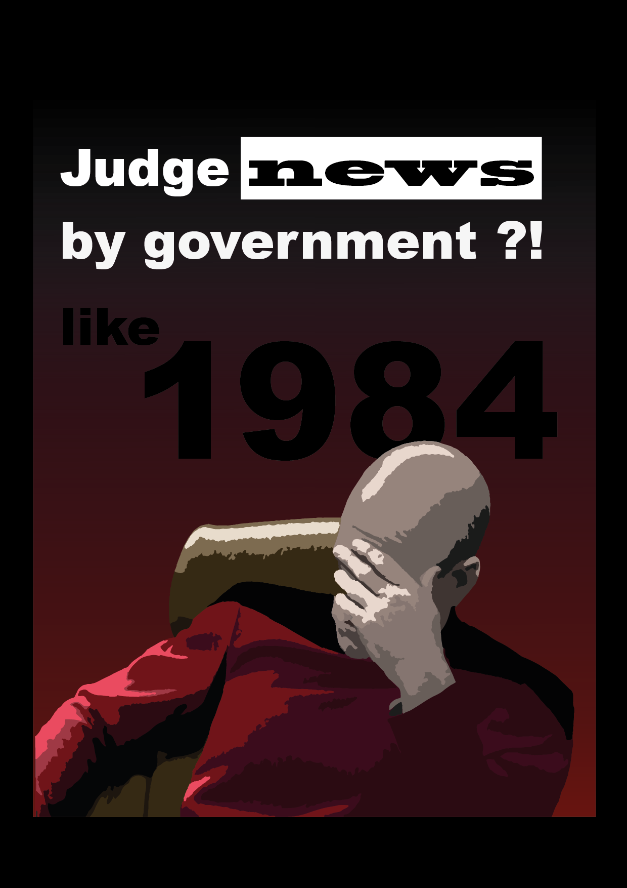
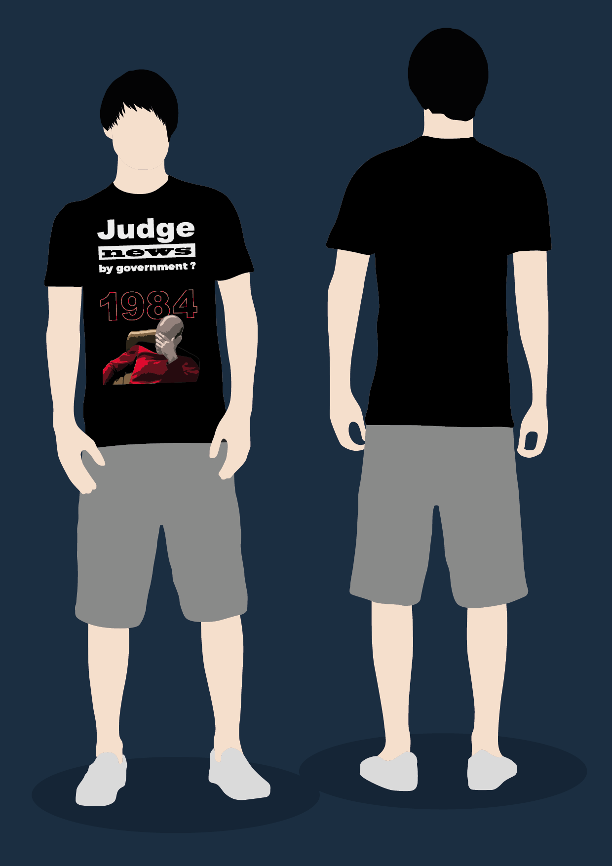
Ok, last one for today. I played around and found this black 1984 much more focused/clear somehow.
Is this the case, for someone who didn't looked at this for 5 hours?
1 Like
Is George Orwell's 1984 still taught in schools? I'm going to have to read it again.
I like the shirt.
I'm not sure, but I see it coming up more often in discussions now in Germany. If not it would not hurt to make this book more known in this times I think. I agree it is a masterpiece.
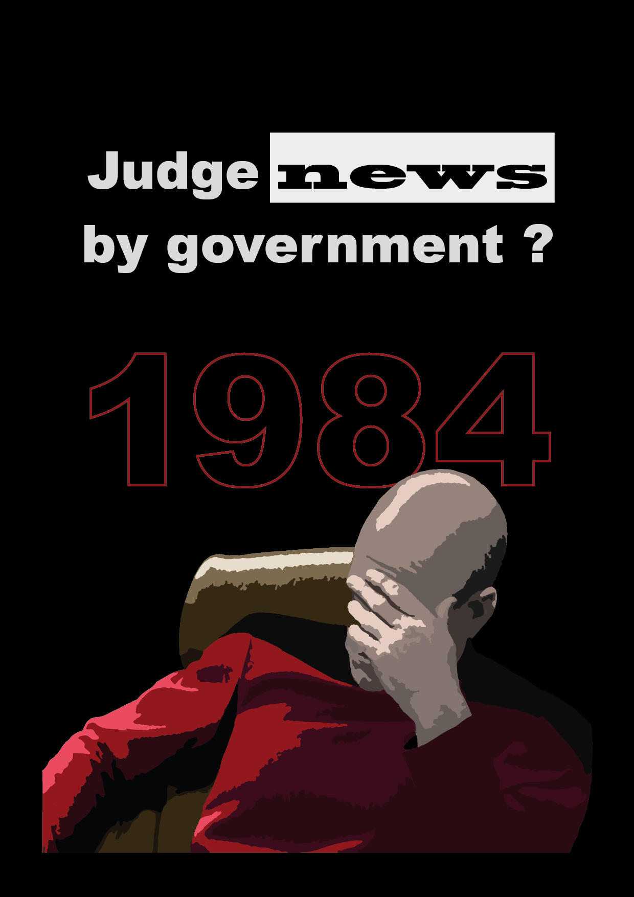
I found a way to make it a bit more simple now, and a bit more fun, at least to my self. ^^
I'm now actually happy with the result. I will sleep a night over it, and will clean it up tomorrow.
Does anyone know, how to ask the Lvl 1 Guys if they want to make a Shirt out of this? Never did any before?
1 Like
Oki, I needed two more days, to learn a bit more about how stuff gets printed on Shirts and such things.
So i took the colourflow out, because:
1) The Colourbox looked not as cool on a shirt as on a 2D image.
2) Colourflows look a bit cheap on Shirts, because the colours they use to print on shirts wash out irregular. Best example are Band T-shirts with colourflow, you probable have seen them with this broken colourflows.
3) Without the colourflow the communication is a bit snappier from further away
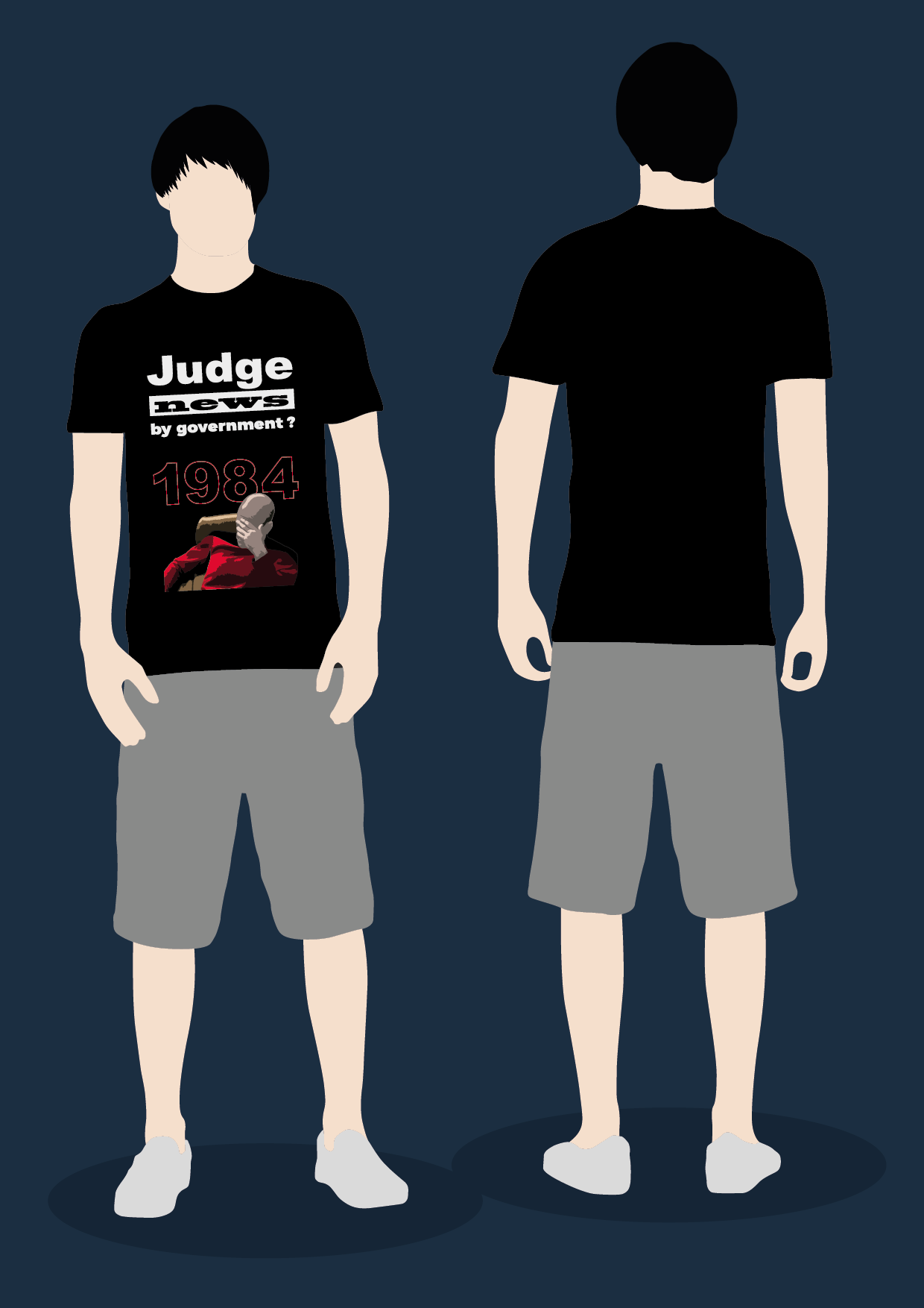
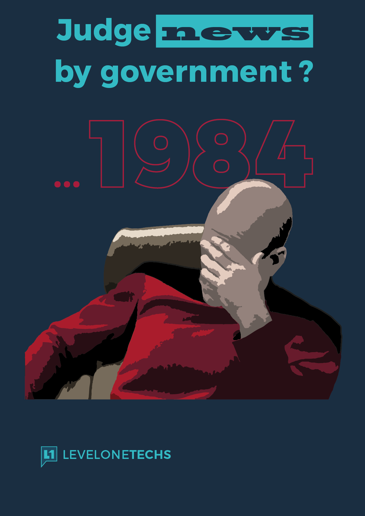
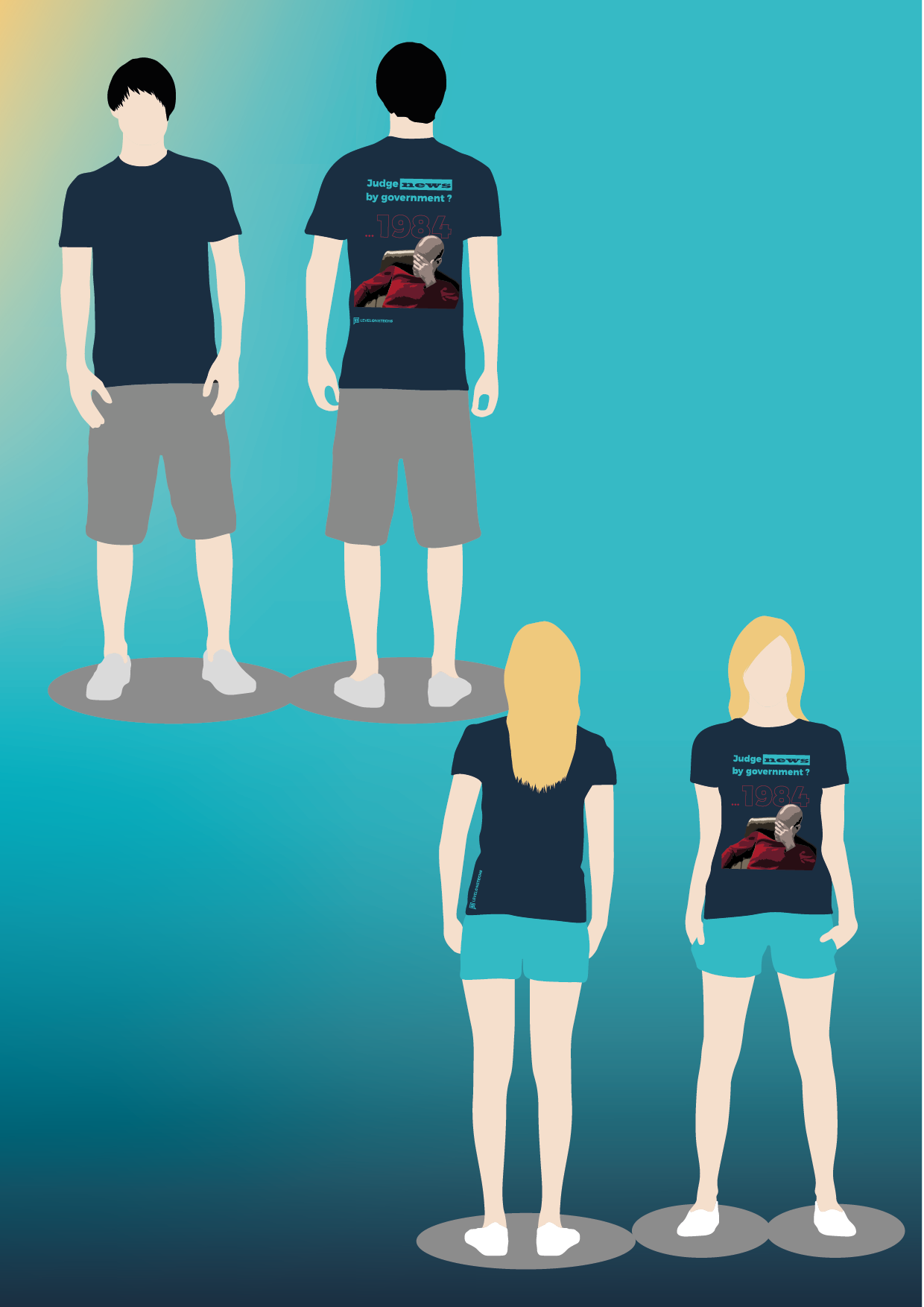
I also made two versions, one with the graphic on the front and one with the graphic on the back. So if you have long hair the one with the graphic on the front might be better, but if not the one with the graphic on the back is maybe cooler.
Also I use the L1 colours and font, to give the L1 guys props for there great channel and the idea for this shirt.
At last I really what to say thank you guys for all the ideas and inspiration. If the L1 folks are able to make this shirt happen, I do an update.
Are some of you still interested in such a shirt?
Cheers!
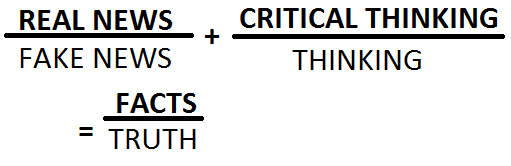
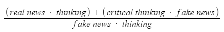
Actually no it'd be
1 Like
not sure i get how that is supposed to be read,
what i was going for is.
real news divided by fake news and critical thinking divided by thinking, equals facts divided by truth.
or
real news over fake news and critical thinking over thinking is facts over truth
The other day in The Lounge someone else came up with a great idea for a T-shirt.
I spent a few minutes drawing up a rough preview.
The black and white versions seam to get more attention (2 likes and one is from Wendell) so looks like the L1 guys don't necessarily want the L1 colours, and prefair it more simple. Or liked what was written?
Now when I think about it, maybe the L1 colours are a bit to much, and I overtought the design?
Also the graphic on the front looks better/more balanced, you guys think so too? So the Shirt with the graphic on the back is not necessary, you think so too?
If I get some feedback, I will try to make it better, if some of you like it and think this is something to buy i would also like to know then I would send L 1 the vectorized data and maybe they make a shirt out of this.. If I don't get feedback or so, maybe the idea was not so hot. ^^ So then I leave it at that, and stop bothering you guys with it.
Cheers!
I've thought of making a t-shirt and one of the things I've noticed is that the back can't be seen if another coat or w/e is worn. If I do a shirt the design will be on the front and small enough to be seen and understood if a coat is worn.
That is a great tip, but you have to balance it against looking to small overall I found out. But I made Picard a little smaller and pushed him and the 1984 more up that way it looks less stretched to the top. But much smaller was not possible, because then it looks so tiny overall on the shirt.