Mozilla is asking for people’s input on Firefox’s future brand design system.
We’ll be using these criteria to evaluate the work:
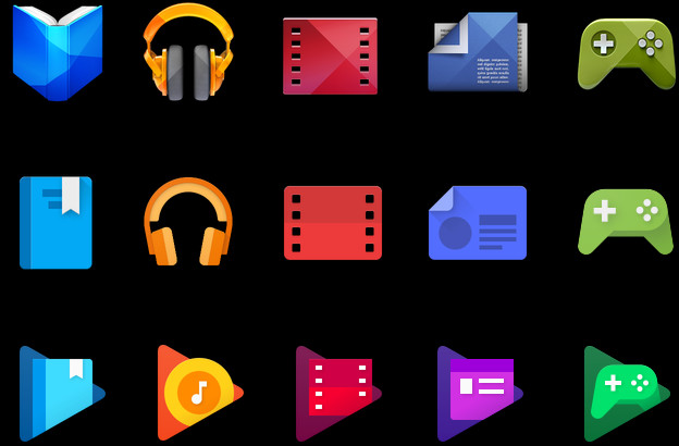
Do these two systems still feel like Firefox?
How visually cohesive is each of them? Does each hold together?
Can the design logic of these systems stretch to embrace new products in the future?
Do these systems reinforce the speed, safety, reliability, wit, and innovation that Firefox stands for?
Do these systems suggest our position as a tech company that puts people over profit?
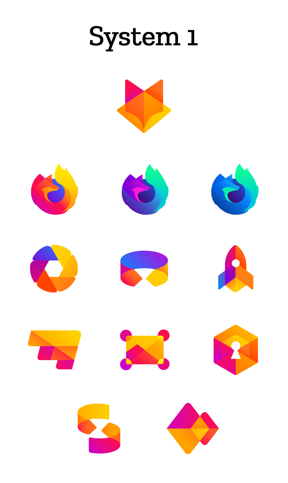
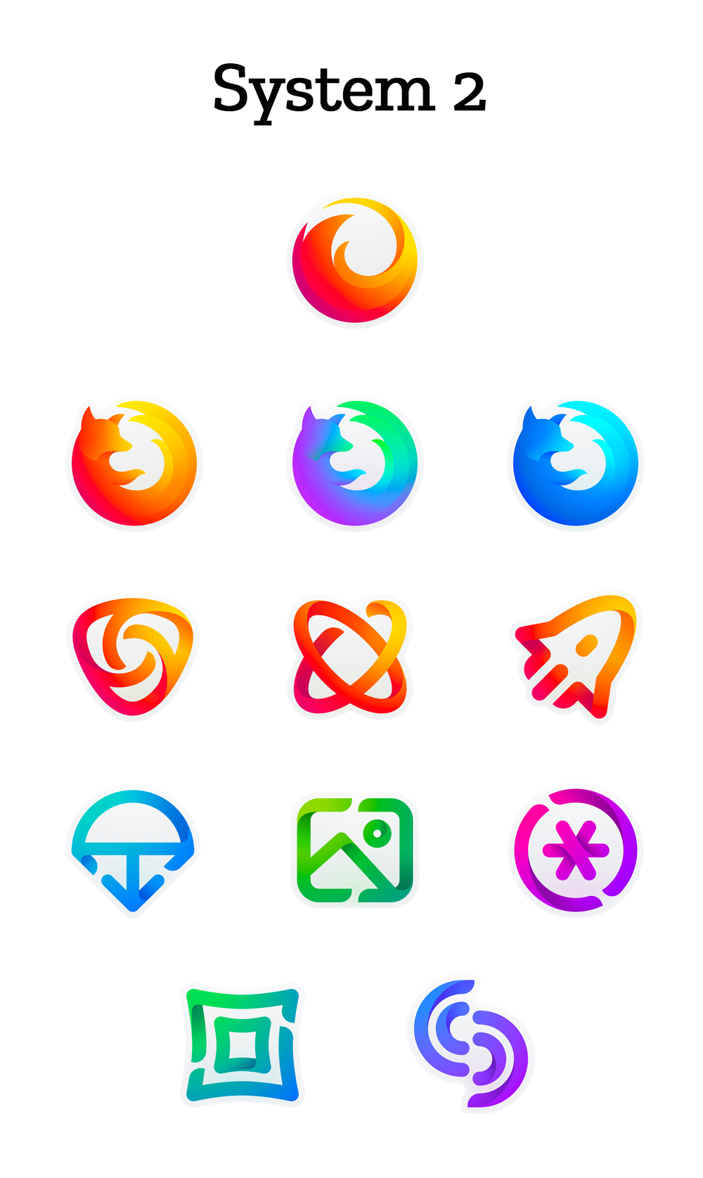
Personally, I prefer the slightly less abstract look of System 1. System 2’s “icons for new apps and services” have too much negative space, making them have much less impact.
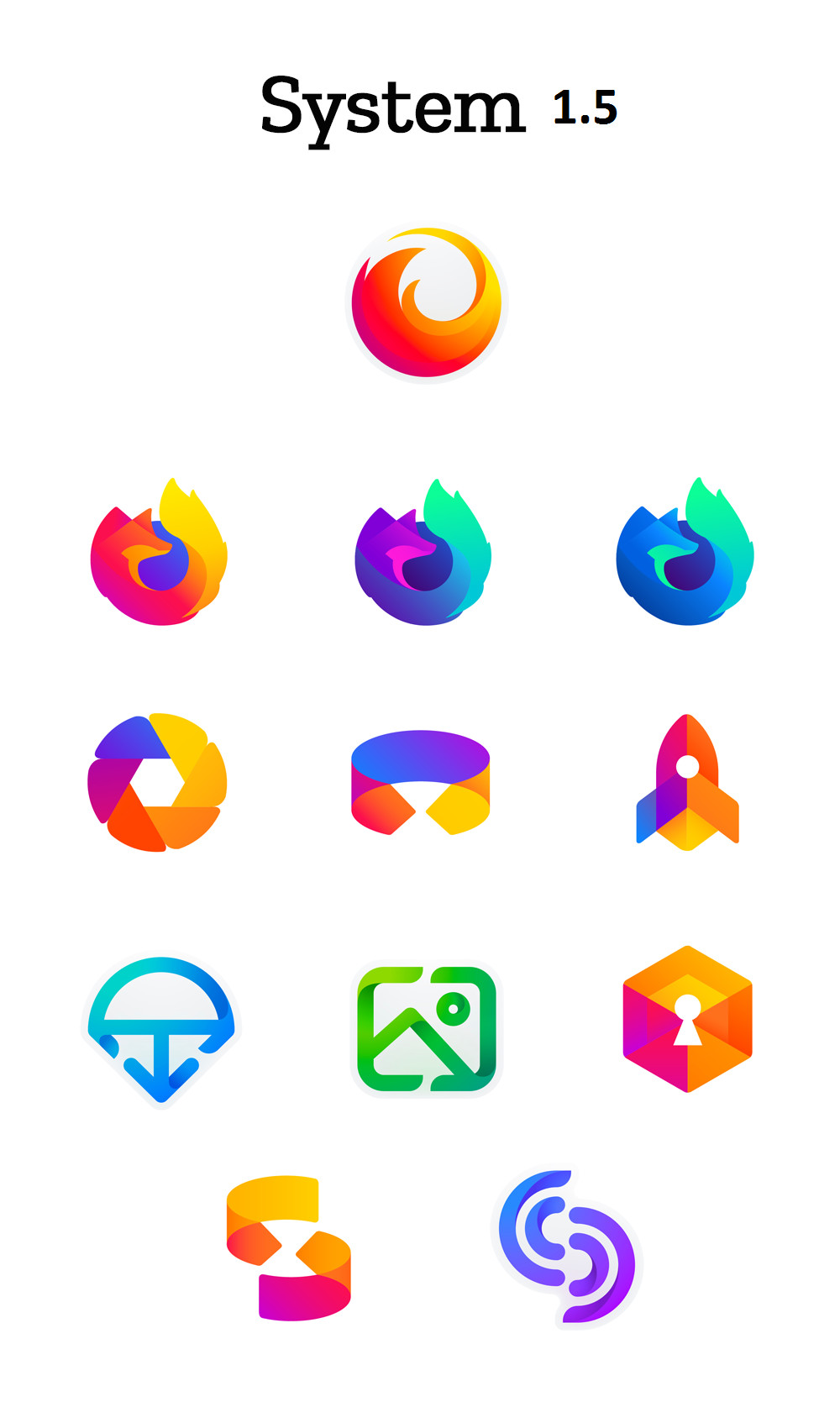
Saying that, as stated in the article, nothing’s final. I’m not a big fan of System 1’s adherence to only a single gradient of colours.
You can submit your opinion at the bottom of their blog post.
It would be nice to see this redesign influence Mozilla’s other products. Bring Thunderbird’s icons out from the early 2000s.
I would vote for System 1 except for the master brand. System 2’s masterbrand keeps the familiarity of previous interations(using a fox tail) while also refreshing the brand.
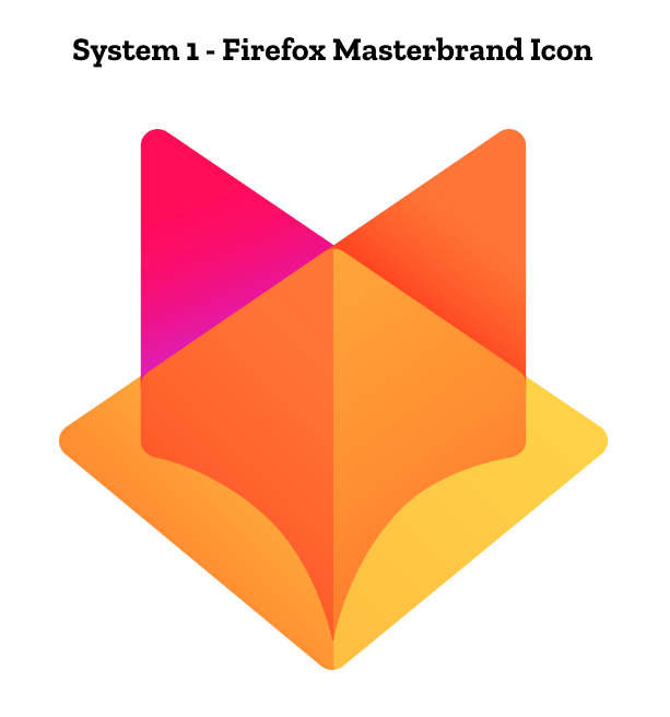
System 1’s masterbrand feels too much like Brave’s icon.
System 2’s icons would look horrible with the current window layout. Transparent background would make it harder for new users to to click.
I assume that we will hear @kreestuh’s thoughts in the level1news for next week?
That is what I don´t get about this: Why the change? What is wrong with keeping the same, familar logo?
Do they want to have the same flat&bland feel windows 8 had and windows 10 now spread everywhere?
I like the first one a lot more, although the bottom half of the icons could do with a few more colours, they all look a bit samey and not entirely distinguished into separate icons.
The second set of icons looks like a misguided attempt to be apple.
The only other thing of note is the the Fox head master icon from set 1 reminds me of the WileyFox phones logo, not the same but similar.
From a readability and consistency standpoint, I think system one is stronger. However, I also think the more solid icons feel a bit like Google’s suite:
The second batch doesn’t appear nearly as consistent. The ff icon is much thicker than the secondary icons, and it’s gradients are applied with a lot more care on it as well. However, the thinner style is more unique compared to other browsers, so it might be the better move. In any case the colors are strong enough to stand on their own.
All those designs look ugly maybe with the exception of the Aperture looking icon.
This is stupid all it’s gonna do is confuse people. They need to stick with this.
At least this looks little bit like a fox.
New logo doesn’t make your product more superior or well known.
When I first saw gitlab’s logo it looked like FireFox “Neue”.
The lack of identity is currently what new masterbrand looks like.
I get the smart concepts behind the shaping, and intersecting lines - but it is actually visually jarring with the way some of the corners of splines do not actually intersect with sharp corners on other parts of the shape [the “curves that don’t touch the point visually but only with their invisble bezier handles” == “hi-dpi futuristic concept”, maybe? mentioned later].
The designer clearly can see something we can’t - maybe the concept of an ident is different to them (futuristic UI ident?). Maybe in the future instead of the icon being considered a glyph image, it’s now considered a fixed point you take note of similar to how you pay very little attention to your mouse cursor.
The issue with this for me is that this is the main icon for the browser, and you’re castrating the love!
So that’s what I think makes the design struggle is that this person is trying to make a design that will last and is focusing on on what the design will do on the future.
When I think about the design in that context I start to think it’s great, the problem is an idiot like me doesn’t really understand the design until it’s finished so I don’t know why they would post this unless this was a final design proposal that may be influenced by public discussion.
I also don’t understand why there is no sense of scale for the glyphs. It’s rather difficult to understand whether something is too thin/too thick when these type of things are based on relative balance to other things. The other objects are there for reference but for all we know the objects could be intended to be tiny.
That’s exactly my gripe with all the tech companies. If your logo is too complicated then by all means make it simpler but don’t be so anal about the minimalism. These new designs don’t even resemble logos just random shapes and lines drawn by 5 year old in microsoft paint.