Found some good resources for defining, identifying, and cataloging dark patterns and deceptive design practices in various software and services.
These are designs in UI or functionality meant to trick or abuse the user into an unwanted action. Often these patterns target those who are less tech-literate.
Examples include:
a service being very easy to subscribe to, yet very difficult to unsubscribe from with multi-step friction and obfuscation
windows installers that hide installation of other unwanted apps, buried in “advanced” or hidden UI so the user skips by unknowingly.
game design focused around gambling mechanics aimed towards children
in game shops that abstract away the currency into intermediary currency to obfuscate the amount being spent. while also setting item prices such that you can never reach a zero balance. there is always an amount of in-game currency trapped in the shop that you can’t spend, which incentivizes spending more to be able to use that currency.
default settings to opt-in user to collection of data without their knowledge or consent.
darkpattern.games currently only features mobile games for now, but say they plan to add other platforms in the future. Mobile games are notoriously bad across the board.
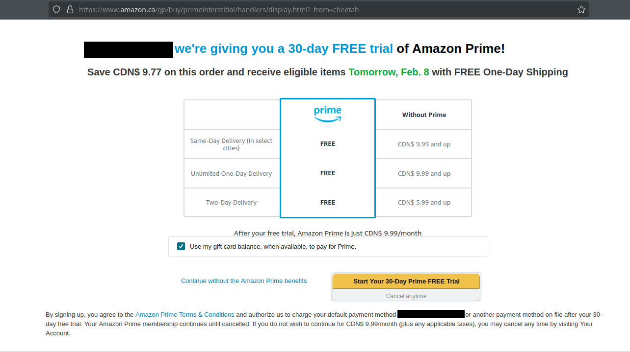
For example amazon. I rarely use amazon but unfortunately there’s the odd item you can’t really find locally. I have no use for prime.
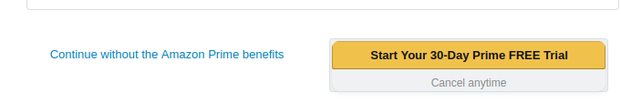
Notice the button UI design on checkout:
In the context of this window the, it’s designed to make the big yellow “Start Your Trial” button look and feel like the next button, while this continue is a small link.
Given common UI language, the continue link looks more like a back or cancel next to the subscribe button. This one is not terribly egregious if you stop and read, but probably enough to trick grandma into blindly clicking.
The websites you suggested are amazing! And the examples really hit home for me since they’re something I got used to avoid growing up with computers and access to the internet. Which can be bad at times, but has taught me so much about how to avoid the pitfalls many people still fall into these days. I swear to god that malicious/fake apps are the new Internet Explorer toolbars.
One I can immediately point my finger to is how websites handle cookie’s permissions given by the user. They give you the option to not accept them, then open a bigger window with options to choose from and still highlight the button to accept them all instead of letting you choose to accept only the ones you selected.
Also the constant barrage of subscriptions I’m bombared by in some apps I use daily, but that’s an auto-skip in my head. Just like having developed muscle memory to not accept cookies.
Other than that I can’t say I notice many of them in my daily browising nor have I been “tricked” into getting subscriptions or buying things for mobile games.
I agree with your last statement. Also, like you, after so many years of being online and having noticed them over 20 years I’ve developed a mental reflex that keeps me from unwittingly falling for the patterns. It’s almost like recognizing where the landmines are.
In the last few years I’ve even started taking it upon myself to point them out to family, friends and even clients. Going as far as explaining how it works. As a result, as far as the clients are concerned, I had earned their trust and repeat business.
The one I’ve noticed lately is the prominent button that asks if I want to continue reading in the app, and in much smaller print, the button that asks if I want to continue reading in my browser. I definitely don’t want another app to siphon my data.
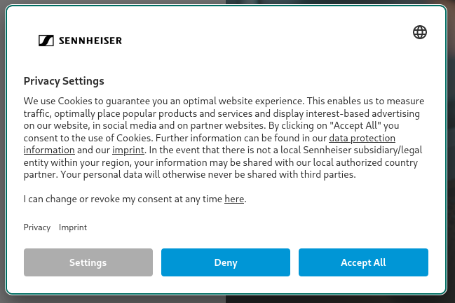
Just visited sennheisers website. I am actually very pleased with this cookie popup where they provide clearly upfront a “Deny” button, and the UI language is consistent.
This is a an example of good honest design, and I want to point out positive examples in contrast to the dark patterns.
W for Sennheiser! something something German engineering?
The real dark pattern here is moronic middle managers using mindless A/B testing on garbage content that doesn’t conform to generally accepted UI tranditions and thinking they found a “winner” because conversion rates are higher. This would eventually come back and hurt a company, but if you are dominant like Amazon, you don’t have to care.
Speaking of Amazon - and I must confess I use them many times a day; same-day or next day early morning shipping is very habit-forming - what’s up with all these sellers nobody’s ever heard of that seem to have names that came from a password-generator?
My first thought was Starbucks card reload. My friend mentioned that if Starbucks wanted to be a bank, it could—from all the spare change it’s holding on to.