An unobtrusive Linux logo

Hello Level1 artists,

I want to share a generic (i.e. not distro specific) logo design. It was made with graph paper, geometry, povray and lots of patience.

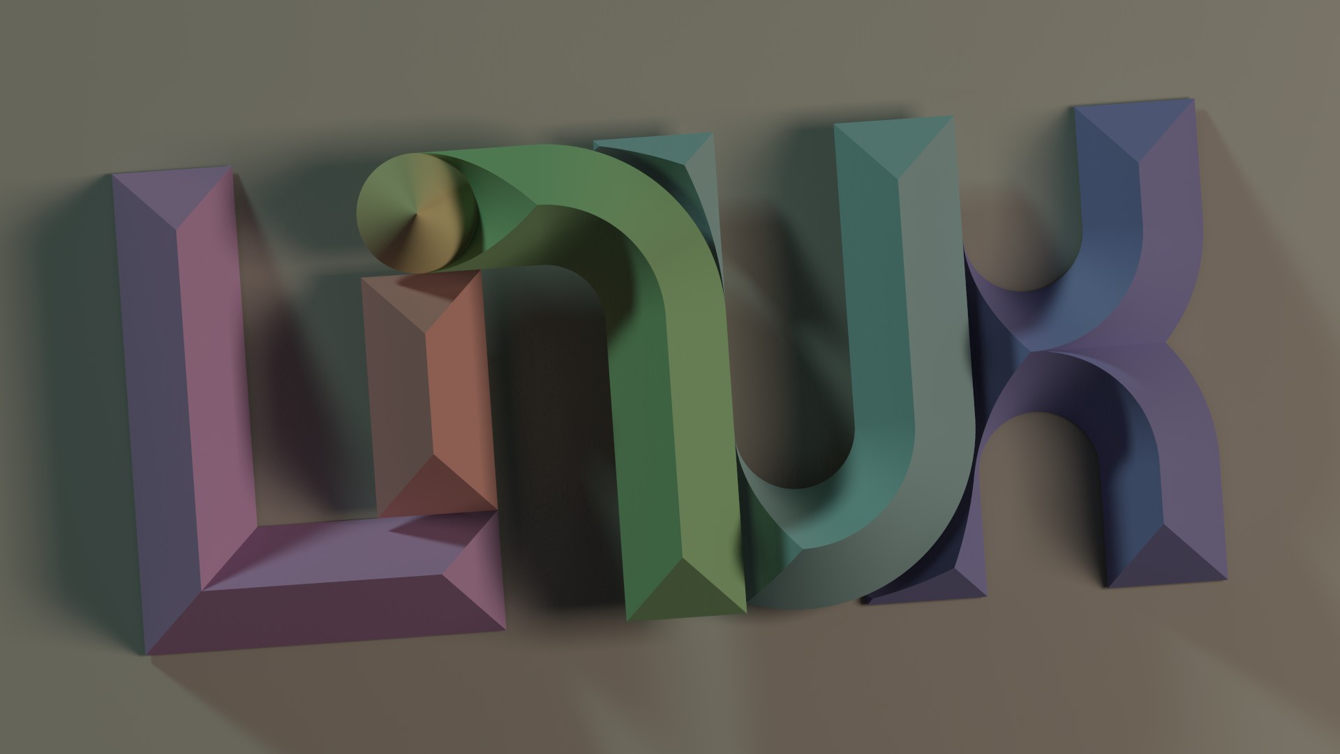
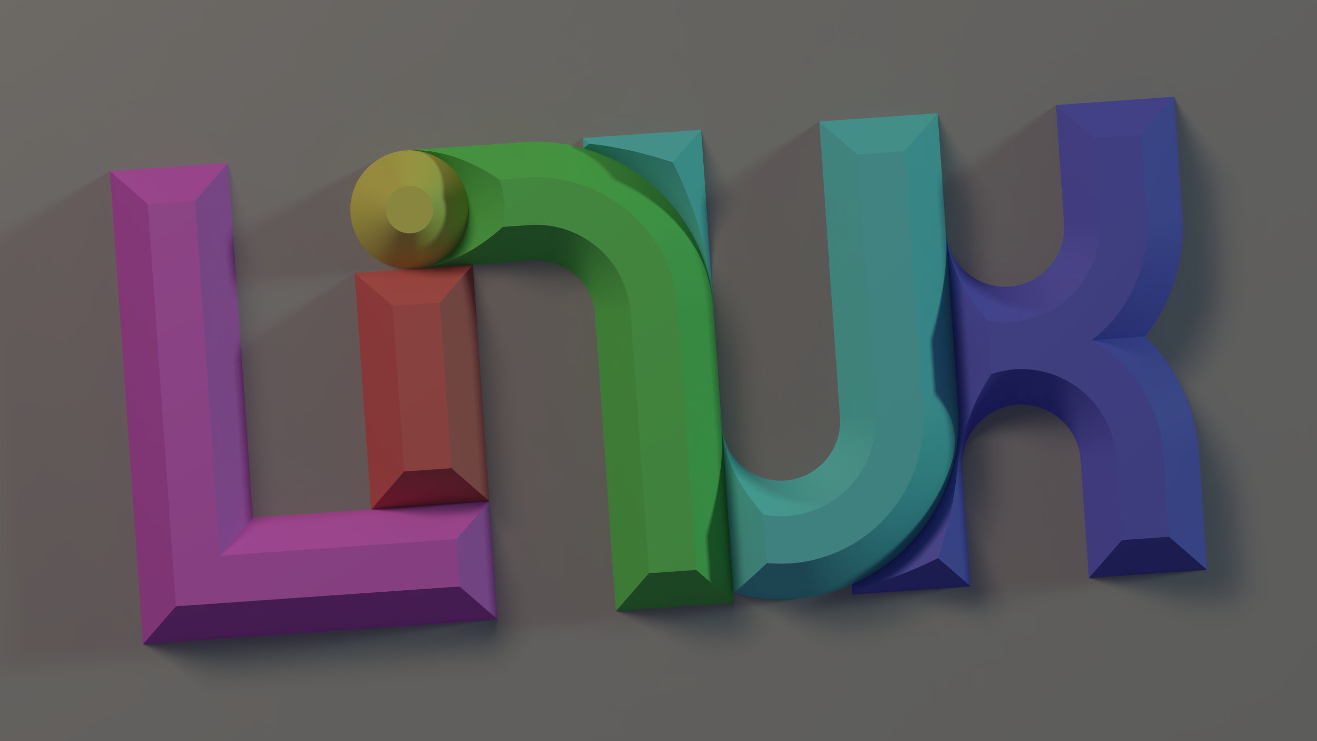
It is meant to be non-distracting as a background, but with enough subtle detail to reward a more attentive viewer.

I place the logo and its animation source files into the public domain. Let’s see if a fresh forum account is allowed to attach a tarball with povray scene description and parameter files … okay, so it has to be a zip … okay, not by new users. Let’s see if I can upload it somewhere else …

dancinglinux.zip

So maybe that works. The zipped source is only 6KB. Rendering times for a whole animation loop are six to seven hours on a 16 core threadripper workstation.

Anyway, I hope somebody likes how an essentially flat 2D design can play with various notions of depth. Feel free to use and tweak it if you know PoV-Ray!

13 Likes

I like it, but it’s too dim, or not contrasty enough, imo.

1 Like

That would make for an amazing font for artsy projects.

1 Like

I can’t unsee Linuk

8 Likes

GAHNOO plus Leenucs

4 Likes

That looks like it took you a longggggggg time. Props to you!

I also really like that color palette

2 Likes

I read Unix

2 Likes

I love the curves and edges! Looks fantastic!

Started making it into a font, will take a long while.

1 Like

(Edit: forgot to quote “I read Unix”.)

I can see what you mean. Nice catch! :slight_smile:
It would take a real artist to work that ambiguity in for good.

You have no idea. The first precursor of this was made for a 4:3 monitor under LinuxPPC on a 500MHz machine.

3 Likes

I am not sure if those geometric building blocks suffice for all letters of the alphabet. And then adjacent letters are wedged beneath each other. I had to use a few tricks to make it barely work for just this one word.

But I am definitely interested to see what you can make out of this!

1 Like

And to everybody: thanks for your attention and encouragement! :slight_smile:

1 Like

This reminds me of the Amiga and BeOS!

I loved the muted pastel color pallete.

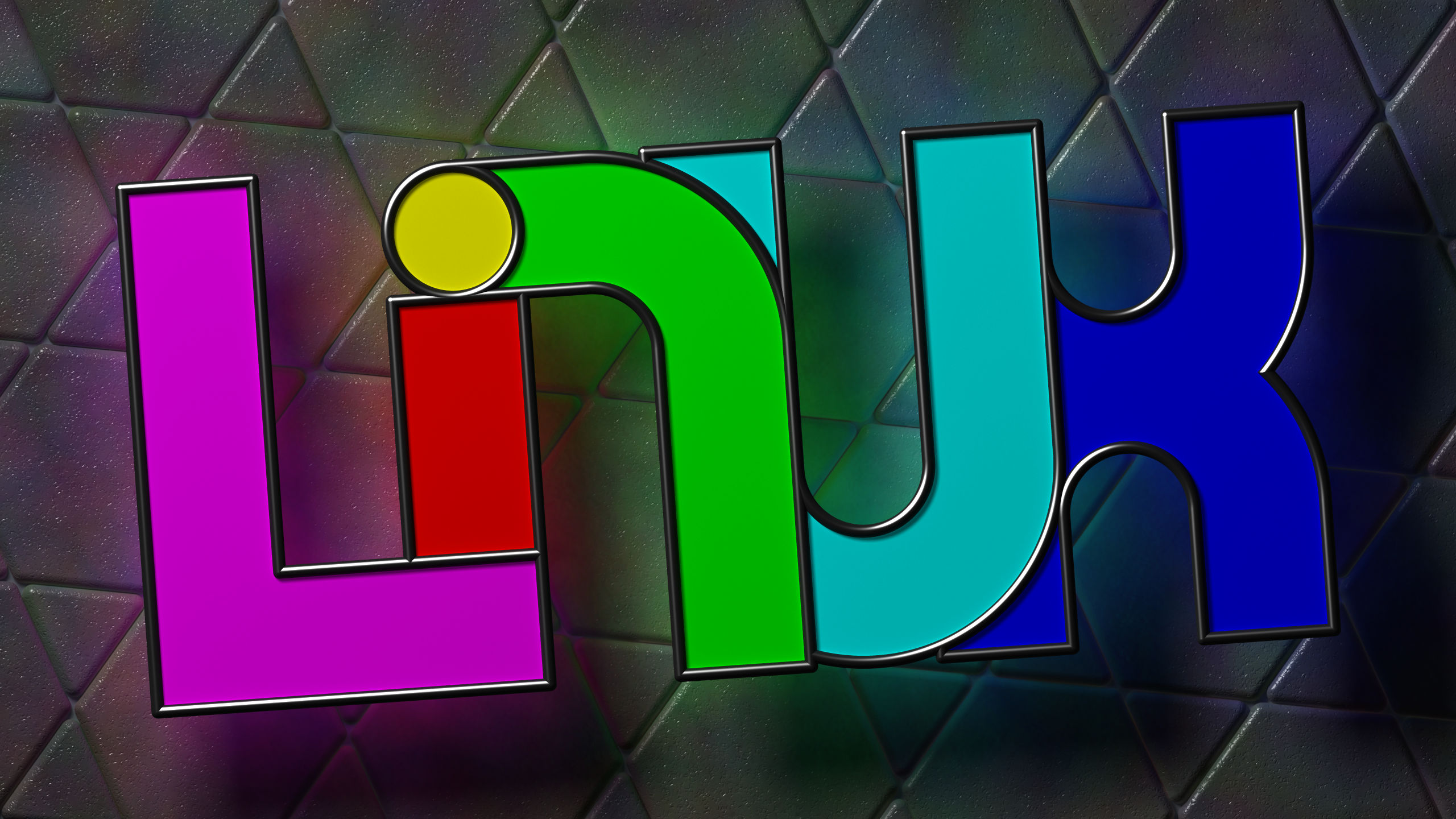
Some bonus material. It’s not the director’s audio commentary, but a look on the evolution of this imagery. Originally the design was flat with pronounced outlines and screaming colors jumping in your face:


That was a bit too busy and distracting as a wallpaper, but maybe it can serve as a lock screen?

Then I began to experiment with bevels:


The colors were still too much, though. The bevels didn’t seem quite right either.

I kept tweaking until I arrived at the version at the start of thread. Then I played with lighting and shadows.

1 Like

The top picture makes it much more clear that it’s overlapping letters.

The stained glass remindes me of the text art from my religious text books from when I was younger.