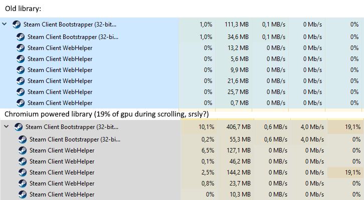
Yup, they AUTO enabled GPU acceleration upon update. Chromium GPU acceleration is notoriously broken on Linux.
I’m on baremetal W10 and it’s chugging.
I’m glad my desktop is beefier. I’m going to have to benchmark some stuff now to see if the new update has effected the performance of games.
1 Like
I did not even think of this, Please do let me/us know.
This is a good idea for Hardware Unboxed too.
Actually, there is a way to benchmark Steam with all CEF processes off vs on:
Launch Steam with zero arguments to get the New Library.
Launch Steam with these arguments to stop all CEF processes and skip straight to small mode: /path/to/steam -no-browser steam://open/minigameslist
-no-browser even brings back the old friends chat interface, but it means you can’t browse the store or community tabs, but it’s the most lightweight version of Steam.
2 Likes
Is there a windows version of that command?
new view working great here on w10, small changes but I like them.
That works on both Linux and Windows in my experience. If not, add +open after -no-browser.
My 2 cents on the new design:
-
Agree with OG poster about change being good as a whole; Steam’s design had not changed all that much since 2010 when I first began using the service, so any positive change should be welcomed.
-
That said, I am equally as irritated by the lack of flexibility of this new design. Specifically, I opened up the Library page of a game, and within 2 seconds, I got the ending of it spoiled for me, as the “engagement” and “activity” focused centre of the game’s page, listed discussion-threads by players who happily chatted and meme-d on aspects of the ending. When I turned the community content off however, all is left is an empty page full of components that I (personally) do not use, but the interface’s ability to view specific sections e.g. my DLC or which DLC I am missing, is more obtuse to navigate than before. I would personally prefer to be able to put first those sub-categories of information that are relevant to me, even if their function is still a bit annoying to use once you position them as you see fit.
-
About the lack of library artwork for many games - I think that this is just a bit sloppy on Valve’s side. I got this design with the Beta release, and more than half of my collection lacked proper artwork (around 250 games). In the weeks to follow some of those have been updated (reducing them to about 220 at the time of writing), however I am surprised as just how many of my predominantly AAA based games-library is just not complying with such basic visual update. One might argue that some titles are too old or the developer no longer exists or there is a HD/Remaster version that has received the library artwork update, but it just makes a sloppy first impression. As a contrast, the GOG Galaxy 2.0 project - it also had some odd looking game artwork, at first but not to this extent, and these got sorted much faster.
-
I was also somewhat surprised that despite the library view’s focus on user-defined “collections”, this leaves games without any tags as part of the “uncategorised” sub-section. Whilst for my cataloguing, this would be synonymous with “Games I’ve yet to play”, I can’t rename this category, nor can I select all games and add them to a category titled “Unplayed” or whatever. So this means that I now have to go over a large pool of games individually and add them to a new category. Not very user friendly…
-
Also, why is it that these categories have to be added via a mouse-contextual menu? One might argue that “Mark as played” or “Mark as completed” are general enough that can be integrated into the main library page’s content, so that a simple click can tag a game as such.
I can go on here, but overall I feel that this is a decent first step (better than what Uplay or Origin offer for the time being), but at the same time, it needs more customisation and more intuitive approach to categorisation.
1 Like
So i saw the post the other day and i thought “what are the guys talking about, mine hasn’t changed in a while” and then yesterday, all of a sudden…
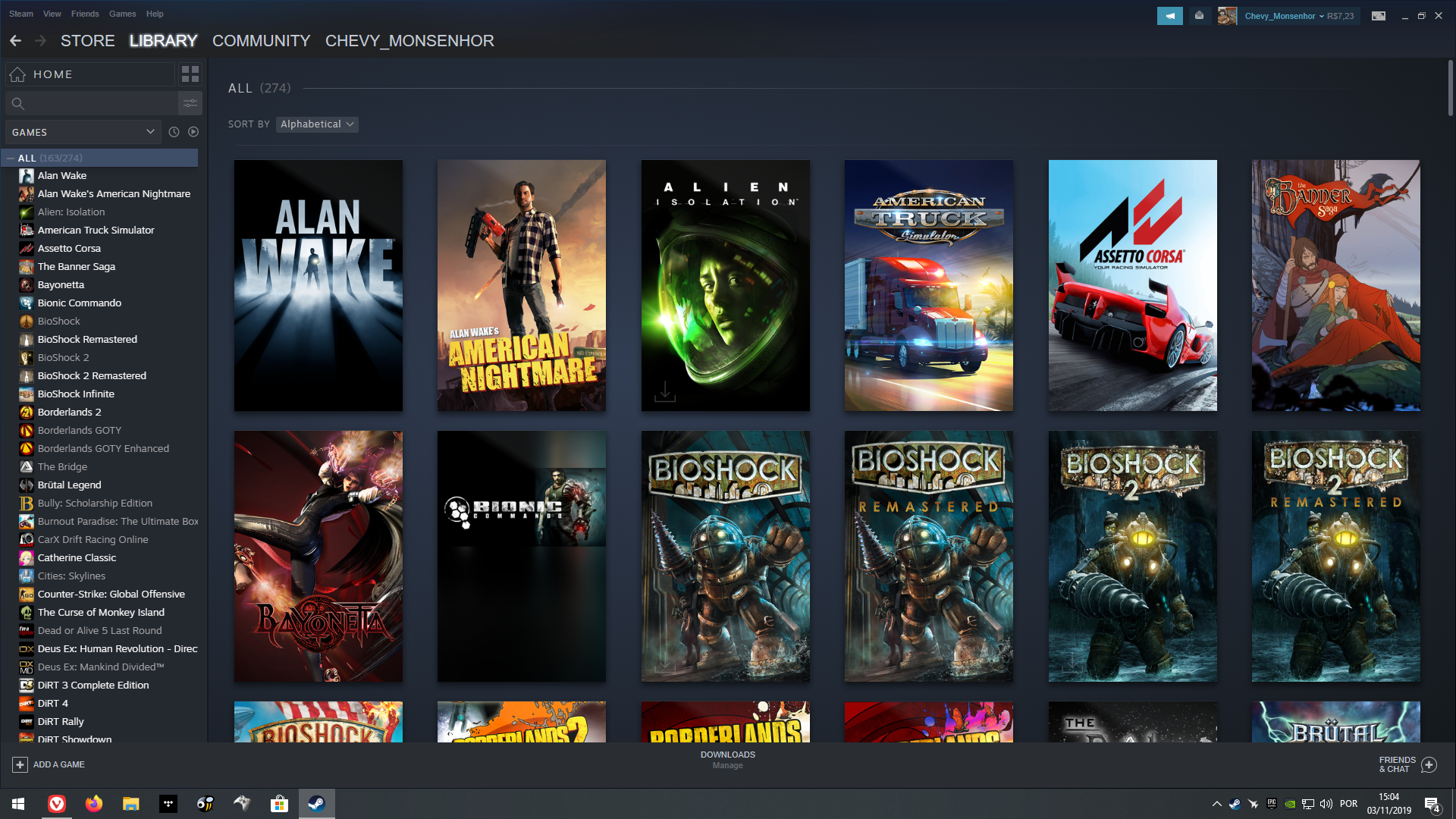
I quite like this design actually, specially when you select a game and it shows everything related to it, feels good to use as well, i only wish they make full covers for all the games, some older titles like Bionic Commando over there look a bit janky.
1 Like
I’m glad to see something happening there. With that said… I need to poke around before I pass judgment.
I also had mine to show only installed games by default. Going to my Library with it not that way is a sad reminder of my past over use of the Steam sales.
2 Likes
My gripe isn’t about the design, it’s about it being a resource hog. Large libraries saturate your entire connection if Low Bandwidth mode is off, and even with Low Bandwidth mode, it’s not enough.
1 Like