Weird thing to think about that we are rounding the corner that I’m sure has been on everyones mind. At least it was on mine.
I didn’t watch wwdc. Theres very few things of value in it for me since the first hour used to be about business bs I didn’t care about or just baseless talking that wasn’t interesting. However, this woulda caught my eye, and from what I hear, most of the stuff we’ve been talking about for years is finally coming out.
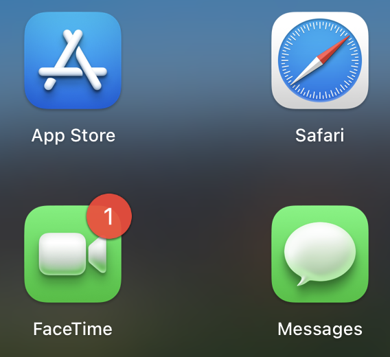
What do yall think of 11? It honestly looks like they saw the last gnome update and shat their pants, with a little bit of ios and anhroid mixed in, as well as the old KDE 3 5 battery meter?
Thats the other thing I heard about. Os11 looks… Scary. I hope they were on acid when they designed these icons because honestly what the fuck are they trying to do. I looked for a picture to post in here but couldn’t find any. They’re in this weird design midground of being 3D and flat at the same time…
It looks yucky apple. Stop doing meth. Its as yucky as your jank as keyboards or removing the headphone jack.
And I get part of it, right. Their 3d emoji stuff, whatever freakshow bs that is, looks similar to the new icons lighting wise. Still, weird. Keep that crap away from me I don’t want tetanus.
What do you guys think of it? It looks yucky as hell to me. Send it back.
Looks like they’re going for the modern flat trend.
Meh?
It’ll probably be like every UI change ever where 95% of users get used to it in a week, 4% will find a workaround, and the last 1% refuse to stop reeing about it for years.
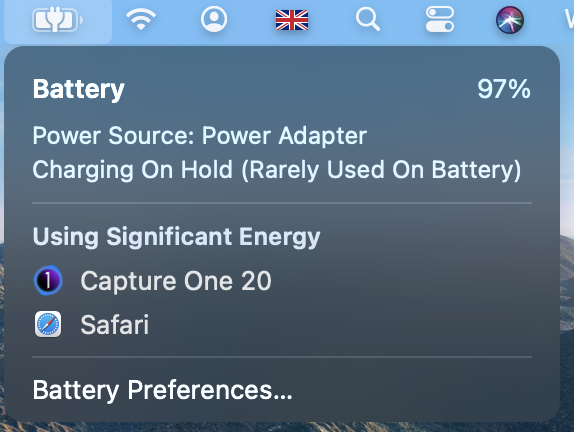
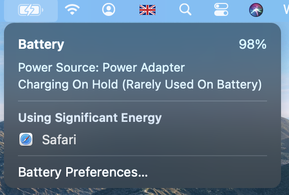
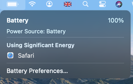
Watched a few video’s on it, took awhile to pin down why it looked off to me but it looks like it was designed to appeal to children. Has an odd mix of professional and toy imo. That battery icon though…
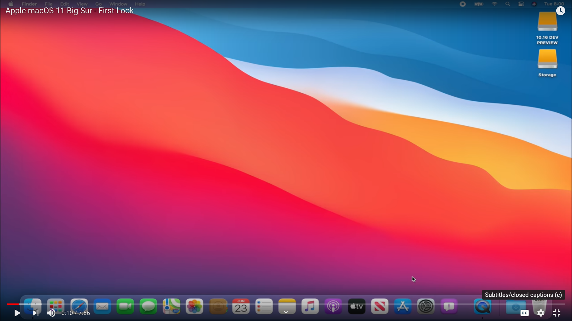
It does look a bit shit, I agree. But I guess I could live with it after doing some minor things. Also I have no idea what it really looks like in use. For example I always have a pretty dark, often black&white background image. No idea what the menu bar would look on that. Or if the dock still looks like ass in dark mode … Things like that.
its still a bsd / unix flavor its no biggy for time but this might be a cool push for arm desktop “armintosh” or “arm-hackintosh” systems
we might see a in ernest arm market build because of the hacker groups who do not want to be apple hw locked so i am hype for software and things getting more powerful in the mobile soc market meaning the sbc market and arm desktops will explode
a latte panda arm that is actually a good arm board its a new low power arms race
Since Ive is gone, they have that new guy running design. Looks like he’s giving several nods to the older Apple skeuomorphism without actually replicating it. Brought the boot chime back as well.
Jobs wanted the UX to be friendly and approachable for nontechnical people (hence the smiley Finder face). It inevitably ends up looking a little childish.
and so was the first power stuff its only gonna be out for a year or two before its broken open even if its a custom chip it only took 15 months to get in the t2 so its going to happen just how much custom work are they really gonna do they still need to allow things for compatibility you don’t wanna reinvent the wheel just its shape
I’m out of my depth to some degree here, but I imagine it would involve emulating the proprietary asic parts of the chip which would be a performance killer.
or by pass most of the time they just handle instructions different
thats all the t2 did and made things hell but its not too far off from the same a tad less cause again as you said will be a little slower but only on a snappiness level like 500mb/s ssd vs nvme pcie 4 2.8gb/s that level of difference
The only thing I’ve noticed about MacOS 11 is that is getting more and more “tablety”. I already didn’t like much the full screen program menu, but now things are getting even worse. All the icons look like they belong to a chinise branded phone like Xiaomi and Huawei for example. I prefer much more flat and simple icons rather than an icon that’s 4K full of details that I’d never spend time looking at.
But I can understand why they want to make all the icons uniform across their different devices. To be honest I’ve never had issues with having different icons and settings along different OSs, but I can see how they want someone to brainlessly tap away on their iPad or iPhone to switch to a Mac and not even having one of their brain cells to fire a signal.
There’s only one good thing about this OS: I think Apple, as usual, is going to be the company that initiates a swtich to a new way of doing things. In particular, this time, they’re gonna make ARM processors relevant on PCs at least to make something more than writing down a document or watching a video. Also Rosetta 2 might teach a thing or two (no pun intended) to Microsoft that, as of now, has miserably failed to emulate x86 on ARM in my opinion.
Isn’t that exactly what’s happened, they’ve gotten more simple, adopted some of the “flat” theming with squaring them off rather than these free floating slanty icons
Legit go grab kde 3.5 look at the battery manager I smear its the same garbo.
Never thought about thi kid thing… Its too weird looking. The imessage icon reminds me of… Who did a nightmare before xmas? When that guy makes models with straight white only eyes, thats what that reminded me of.
There appears to be three states, two in regards to being connected to a power cable, one on battery. Im not 100% sure what the difference is between the first two, I expect maybe something to do with the changing state/power primary power source. Seems like it might still be wip.
Kinda, they look more cohesive for sure but they’re still kinda bubbly, using shades, fading colours. Just not my cup of tea when it comes to this aspect. I never liked it.