Showcase Your Webdev, Web Designs & Graphic Designs

I've recently created a design that I'm actually quite proud of, especially considering how long it took me to create, literally about 5 minutes. Considering it only took me 5 minutes to create, I think it looks f!$king gorgeous. The only actual issue that I've seen so far is that it just doesn't work in an old as hell IE, even then, it's only a minor issue, it's just the matter of CSS filters not working. HOWEVER, the company I work for, their target audience is for people who're up to date with fashion, tech, etc, from case studies and what not, they've told me to not worry about old browsers. I've specifically been told by my boss to not even worry about IE 11 or older, so I'm cool with that. :joy:

The entire design works in IE 8, the only thing that doesn't work is the CSS filter, that's it, I mean it looks fine without it if I'm honest, but it looks a lot better with the CSS filter effect.

I was just thinking, why don't we all share and show off some designs that we've come up with in the past? - Also comment how long it took you to do, just out of curiosity.

1 Like

C'mon, You can't give us this teaser without showing us your design. How about a screen shot (a link may be against the forum rules).

I don't really have anything to show as my first (dead) website was like 10 years old and now I am using WIX. I am a print graphic designer. When I took a Dreamweaver course my friendly professor asked me
"What do you hope to get out of this course?"

"I want to pass without ever typing a single line of HTML."

He was aghast and spent all semester trying to convince me that coding CSS and HTML is fun.
He failed, but I passed because eventually I did type a little bit of code into Dreamweaver.

Hehe, sorry, I was kinda waiting for that, I'm just happy with how clean it looks. It's nothing fancy or anything complex, it's just this, I don't know why, I've always struggled to get my typography skills to work to a half decent standard.

PLEASE keep in mind, I am a developer, I am NOT a designer, I'm great at making things work, but making them look pretty.... Well... I've always wanted to be able to, but I've always felt like something has been missing... Recently I've been learning a lot about the golden ratio, and design principles like that... I was even giving one of our graphics designers what aspect ratios I wanted images in.... I'm clearly getting better at this.... I mean please, PLEASE keep in mind, I'm used to just writing super fast algorithms and making sh$!t happen... I even have proof of have a bit of proof of some of my behind the scenes work....

I had to write an algorithm that used some code that a previous developer had done, he did an awful job, his algorithm literally took about 5 minutes to execute, well I added a few things to it, got it down to let's say half that time. But what I did next was just sexual, I got it to execute in under a minute, while maintaining all the exact same functionality.


My First Attempt


The Second Attempt


You see my point, right?

I can do things like make a super fast searching algorithm, but making things look pretty, taking nice pictures, etc, I've just never had that talent. :joy:

Again, this design, it's nothing mindblowing, but I'm really happy with how clean it looks. And TRUST ME, it looks better than the previous design.


Old Design:


My Design:


Normally, I personally hate a drop shadow effect, but a subtle one in this exact case, I personally think it works kinda well due to the background picture(s) being in grayscale and being blurred, I just think it helps it pop a little more. I don't know what you think? - Your design skills are probably WAY better than mine.

Could you show off some of your designs then? :wink:

1 Like

My first site no longer works, even from my HDD. Back then Apple style 'jelly' buttons were in style. I went one better. All of my buttons were 3D modeled lenses over my art and when one clicked, the lens button would deform with optical perfection. Also, rendering jelly buttons was easier than drawing them.

Up, you can see a little lens distortion.

Hover, the buttons would glow green.

Down

I designed the site in Photoshop, then used Dreamweaver for functionality.
Basically it was an about 50 image slide show. Each of the 9 tiles would jump to a different chapter/grouping of images and then one would continue down the list. Very simple. I planned to do a optional intro animation but I never really finished to my satisfaction. The 3D animation part was most important, hardest to make, but very boring. This is called Jack-In and is inspired by the book Neuromancer.

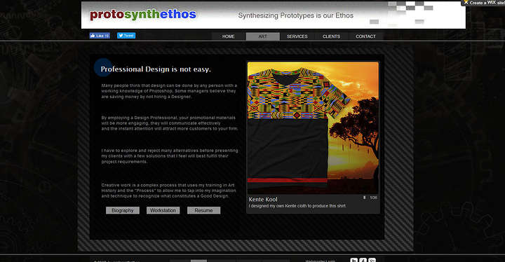
Here are 2 of my current pages. My home page is a joke. Because I get no views, when I updated it I deliberately made every design mistake that one should never do and I wrote a really weird "wall of text" so most people (hopefully) will never read it and go straight to my porfolio.

I too like clean and simple websites. The background gears (represent the workings of my inner mind) are a little busy so I made them dark (I prefer dark screens). I put the carbon fiber over that to make the text more readable. All of my buttons are flat rectangles, but each page has a circle on it somewhere. For some reason WIX insists that your header must be Flash, so I made the "pixels" on the right of my logo slowly and randomly and not perfectly aligned animate. The white area used to be transparent, so I am going to have to fix that.

1 Like

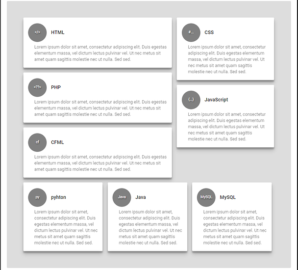
Interesting, I'm personally working on my own front end miniature framework, just for fun more than anything. I think that it's more than simple enough to workout if you didn't know how to use it. Additionally it supports things like material cards which I personally love, I've had my own take on making them, they're all dynamic and look pretty $wag IMO.... However the example I'm working on right now looks f$!king disgusting, I'm not gonna lie about it, I mean it's a spare time thing, I'll show you what I've done so far.....

Keep in mind the odd colour combos because of testing.


This screenshot is of a grid containing a bunch of material cards... Simple enough..

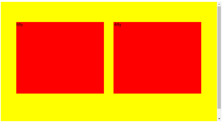
This is a parallax scrolling feature that I'm currently working on too, the colours obviously look foul right now..

1 Like

I like those cards.

1 Like

Haha, thank you, I too love material design, simple, fairly clean, also has a nice and friendly appearance, a bit more easy on the eye than things that are super high with contrast and sharp 90 degree edges, etc. I think you get what I mean?

As for mobile development, I may have just found a framework that's perfect for building a mobile application, in all fairness, it looks pretty impressive, Framework7, never used it so I can't say, but it does look pretty cool in all fairness. :stuck_out_tongue:

Yup!
And Material Design works better on mobile too.

Very god damn true!

I'm just debating how to make my next website, I mean I'm not exactly super worried about SEO ranking or anything silly like that, I mean at the end of the day, I'll put a link up to it on social media, my cv, etc. But it's hardly gonna be a huge website that I expect to have a tonne of traffic on. I previously made a blog with WP, I'm not even sure I'll bother doing that to be 100% honest, I'm just looking to build a fairly pretty front end website, mostly static, maybe use AJAX here and there, I don't know yet, I'm still debating what overall theme/layout I want and what not...

I don't know whether I wanna have a formal and neat theme or a very in your face one or just a fun and friendly one, you get my point, I'm still a bit clueless about it all... :joy:

If it is going to be part of your cv / resume /portfolio keep it mostly formal, but hide a few fun pages in there that are hard to find. I used to have a page on my site called "The Punkin' Posse" that listed all of my friends gamer tags.

I carved that scary gourd.

"Normies" could never find it unless I told them which image had to be clicked on to link to that part of my site.

2 Likes

I might just build a stupid little game in JS, something stupid, but something to demonstrate that I can actually use JS. Simply because of the fact that thinking about how I want my website, it'll look really pretty, but there won't be a tonne of functionality there.

I'll post some stuff here in the next few days.

Good to hear, the more the merrier! :slight_smile:

1 Like

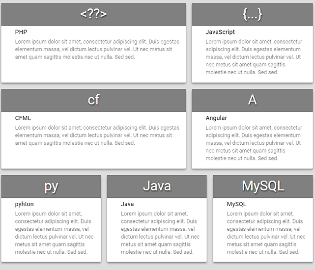
Minor update, I want to get people's opinions on what looks better, the initial design thing I made with the material cards, or this one? (circles have become rectangle, more banner like).

The alignment is also a lot more neat and tidy, IDK what you guys think? :slight_smile:

I just want opinions because it's a framework.

Another idea I had was to make it look like the updated version on mobile, then make it look like the original on desktop/laptop. Again, I don't know what you guys think?

I'd love to contribute to this thread, but I don't have anything to show-case ;_;

I am working on a project for my work though. Making a trailer log application. Sounds simple until you see how much crap they have t record.

I decided to use Meteor and so far I'm enjoying it. I'm going through the struggles of learning a new stack but it's a labor of love.

It's fine, honestly, I've recently been doing a tonne of backend things that aren't very sexual at all... I've been working with some databases that are just f$!king messy asf. I mean large chunks of data that's just missing, it's a joke.

However, the past couple of days, I've been working on a few nice little projects, yesterday I built a dynamic part of a website that pulls in the most popular products, and it updates in real time.... I had to do some sketchy things to try and get there, it's mostly because of the structure of the database... I had to initially create a query, easy enough, I then had to loop through the query creating a structure for every row in the database. I THEN had to loop through my array of structs and eliminate duplicates, and i had to do a surprising amount of logic and arithmetic. I then had to sort it, which is a lot more of a pain than what I thought it would've been, simply because I'm trying to sort an array of structures on in a descending order, according to key 'x'.

I then had to FINALLY get the top 'n' number of products.....


So yeah, that was quite interesting to do to be totally honest,quite nice if anything, but because I'm still learning ColdFusion (language that's used in my place of work), I was running into brick walls here and there! :joy:

I looked into the Adobe CF suite and holy cow the $$$.

Yeah, THANKFULLY... I'm not the one paying for it, it's a nice language to use, VERY easy.... It actually has so many things built in it, it's kinda annoying, like you'll write something complex and kinda fancy, turns out they beat you to it half the time and you've just wasted your time... HOWEVER, if like myself, I have actually written things that are better than the built in functions and features.... Like there's one thing that's built into it for searching, it's great and neat, but on a huge database, it can run slow.... Well my algorithm runs like lightning, not to blow my own trumpet, and tbf to the guys that made CF, I'm sure they just tried to make it as generic as possible, as you can imagine!

Hi @MaybelleMorgan, does a set of all sets contain itself?

#makebotsgreatagain