I am looking for somebody that wants to join a green field project. We cant pay anyone but you will get some stake of ownership when the product is complete.
details:
Name: Terra
Market: peer to peer garden care/lawn care
I am looking for somebody that wants to join a green field project. We cant pay anyone but you will get some stake of ownership when the product is complete.
details:
Name: Terra
Market: peer to peer garden care/lawn care
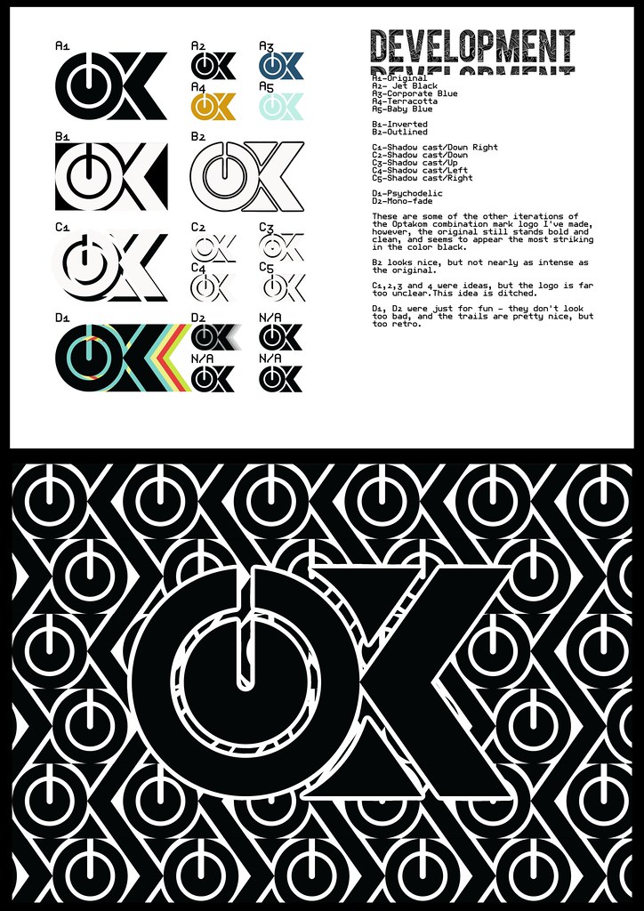
Depending on what you need done, I can give it a shot.
Just open it up on here (e.g describe the type of business and anything you think is important)
…and see what you get posted
there is no harm in it 
keeping these things open and as a developing thread helps l1t as it gets them repeat audience / page views
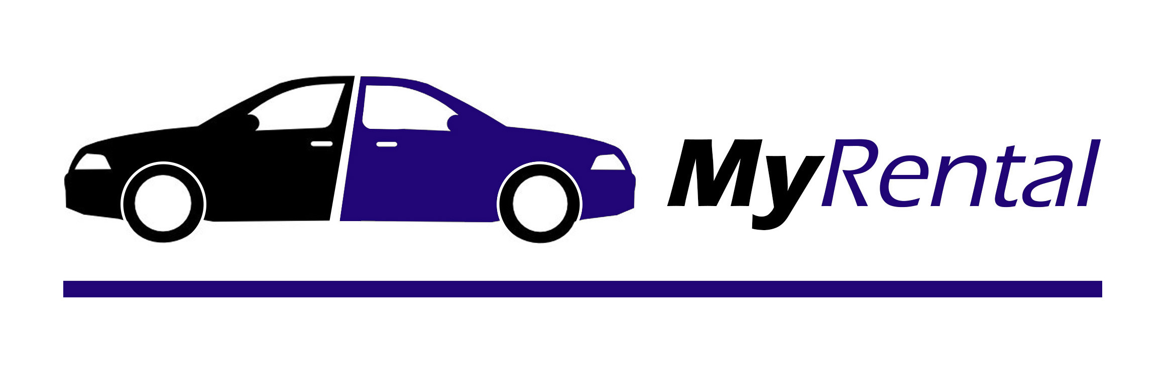
Is this car messed up or am I just drunk ?
You’re drunk and seeing double.
Damn what happened to this one ? I get it one in the graphic may be some custom job but the fuck is wrong with the world to have 2 messed up cars ?
one that I designed. It’s not based on any real car. I hope I don’t get my artistic license suspended.
It has to do with the mission of the company and means the rental cars are coming and going.
Please note that the angle of the split between the doors aligns with the italic of the font. That makes it look a little weird because the 2 halves are not a perfect mirror. A straight up and down split looked boring. Details, details.
Damn now that you explained that I kinda get it … but isn’t a logo supposed to be non explainable ? Like you see it you get what is the idea ? Or were you going for the shock factor with this ?
JK JK don’t get serious I like it 
I just went with the first Idea I had. It popped into my head instantly, then I drew it up.
To the rental car customer, yes.
But you always have to explain / sell a logo to your client if you want them to pay for it.
Color Studies:
I stuck to colors that other car rental companies are using but more subtle, sophisticated and friendly, instead of being bold. I dismissed yellow and orange because they are identified with certain brands that ‘own’ those colors.
I was left with RGB.
I like the burgundy design the best and the simplified all black car on teal is nice too.
The purple design didn’t work when on the left. On the right looks better, but not good enough.
Out of the three shown, top one is my favourite
I think the coming and going car representation works well
Fonts are typical of motoring fonts that I see used often (not a bad thing)
Really dont like the border though, think you would have been better off with just a bottom line representative of road? (probably overused though).
Thank you for the valuable Focus Group input.
It’s hard to work in a vacuum.
The top one was my first idea, maybe that is best. In design, blue is a lot of peoples favorite color. It’s calm and comfortable. So I always try to give the client a blue option.
I will think about changing the border. I like the underline idea like a road. When I first did the logo it seemed to be floating on the page. I added a line around it to be like a sign, then I thickened it up to be part of the logo. But I really like how the red one is split 1/4 black and 3/4 red. Maybe I will make a line like that.
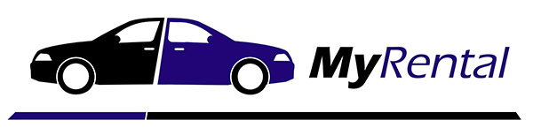
I agree that looks better.
I made the end cuts at an angle for perspective and the color split adds to the perspective too.
winner
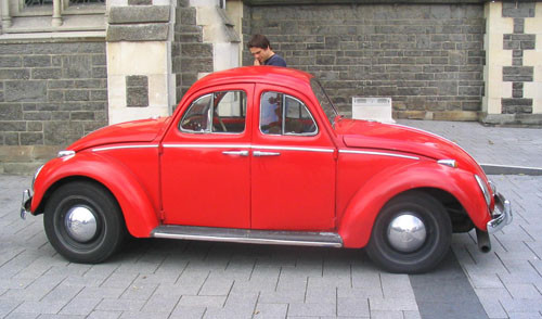
I only had ms paint on the machine I was using so I couldnt slant anything,
was safer for me to just delete bits
my sides