Why? It’s working out fine the way it is.
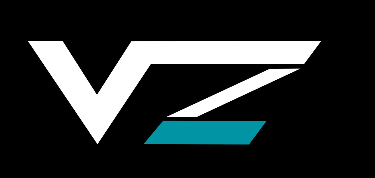
Give it another go but those latest designs are trash, it looks more like √2 (square root of 2) than VZ .
1 Like
11 Is what I voted for but it is really a toss up between 11 and 12 for me. Not sure which I like more.
It definitely cleared up the Z looking like a 2 for me.
V and some hentai letter
It def. looks like an Asian character after the V. Doesn’t really come across as a Z because of the curve. 1,5 or 10 look the best out of them. The overlapping of additional … curves complicates it a think.
However the angle is a bit wrong in @MazeFrame 's logo, needs rework to fix symmetry.
1 Like
I wish I could draw.
The v and z nestled together, two different colors.
The top horizontal bar of the z starting just to the left and above the v, the difference in height being the thickness of the letters.
the two vertical portions of the letters touching,.
The bottom horizontal z going to the right of the v with the very bottom of the v and the very bottom of the z being different height, the height being the thickness of the letters.
Make sense? Can someone draw it for me?

The horrizontal lines look a bit off, looks good overall.