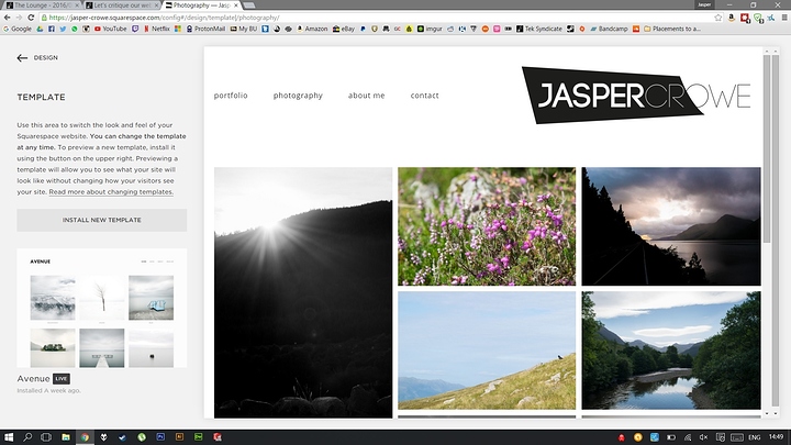
I haven't seen anyone post about this on here yet. I'd like to see some of your websites out there. Photography websites that is. And hopefully have the community critique it. I've spent a lot of time on mine and I don't want it to look bad. I want to see other people opinions on it. I'm sure you'd like to have critiques on your website as well.
So here it goes. Here's mine:
I find it a bit odd that you image for travel | adventure, isn't the same size as the other images on the front page.
It just looks off. (http://justin-hardigree.com/)
Kind of the same "problem" with diffrent image sizes on the about page. (http://justin-hardigree.com/about-1/)
On the contact page there seem to be a boarder that you missed to the left of your google voice number. (http://justin-hardigree.com/contact-1/)
I'll see if I can find some time to go through the entire site later but I hope you can use this for now :-)
Oh God why is the picture on the front page not the same size.
My eyes!
no thanks, this is great info. I didn't really think much of the very different sized images. Will work on fixing this now. I also realized I hadn't even looked at my contact page in a long time.
Your photography is miles better than mine, but get a proper grid. It looks too sporadic right now.
You can have different sized images. Just make them line up.
Still adding to my site, so just focus on the layout.
Just fixed my home page, and contact page. Still need to find a good replacement for the about page. Will look at yours real quick now ;)
I think you're using the exact same Squarespace template as me.
I thought the same thing as I went thru yours lol. I didn't quite like the idea of having too many "folders" or "projects" or whatever squarespace calls it. My thought was that there was too much hidden there. But at the same time I didn't want to have too many pictures. I like your page though. You seem to have pulled it off better than me because you actually had a group of pictures that were related. I don't typically shoot that way though.
Thanks. I've only had my camera for about 6 months, so I don't have that much stuff. Going to have to organise it into proper galleries when I add more.
I think it's a good idea to have a full/busy index page, because you can show off your skills (or lack of, in my case haha).
I just looked and I'm using the Avenue template. Also I like how you do a lot of things, and also how un-cluttered your website is. There are so many out there that makes you kinda lost as you try and navigate you through it. And yea, with the organization of the index/homepage my thought is that my "customers" or fans can easily get to the types of pictures that they want to see. Because I have a few different styles.
Fixed it. It was actually the same size on my window when you don't have it full-screened. Sometimes I go half-screen on windows for more room
Agreed
