I am new to graphic design, but I am trying to pick it up while starting a brand for myself. I have the idea for the logo, but have no idea where to start, I have adobe CC because of photography. What should I use to make the logo, I was thinking I would use illustrator for the SVG support. But I am new to this what should I do where should i start?
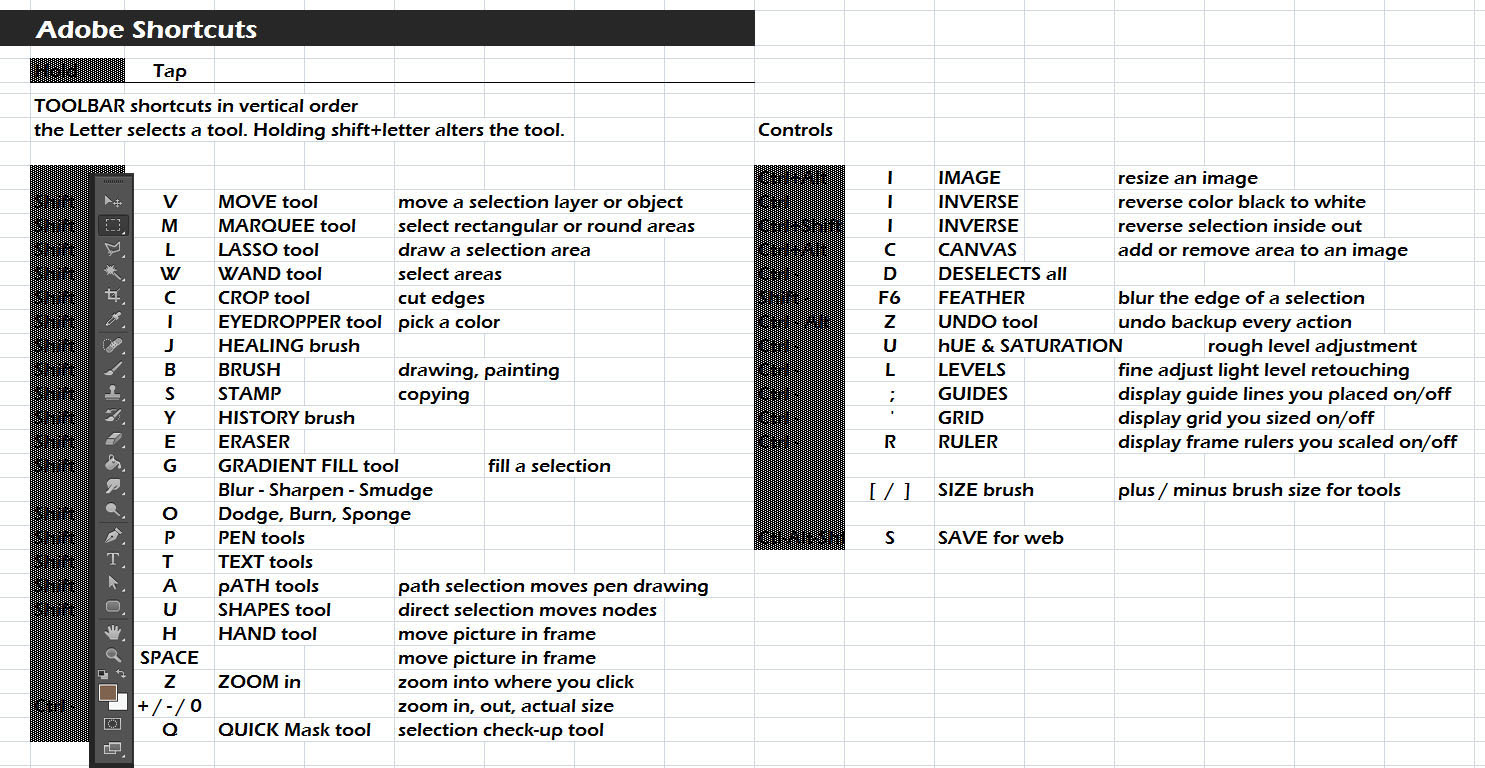
Shortcut, Selection and LAYER mastery is the key to Photoshop. NEVER change your pictures! Copy the pic onto a new layer and work on the copy. Draw on top of your picture in a new Layer. Experiment in new Layers and flip the eyeball on/off to see which version you prefer and how experimental Layer #3 will look better.
The Draw tool holds the Line tool if you hold-click on the fly-out triangle in the lower right. LINE can do or Fake 80% of the vector drawing in P-shop.
For real vector drawing one can use the Pen, Shape and Text tools. For the tough stuff I open illustrator too and transfer back and forth between P-shop. My preference is to do most of the work in Photoshop even though illustrator is the normal way to design vector art.
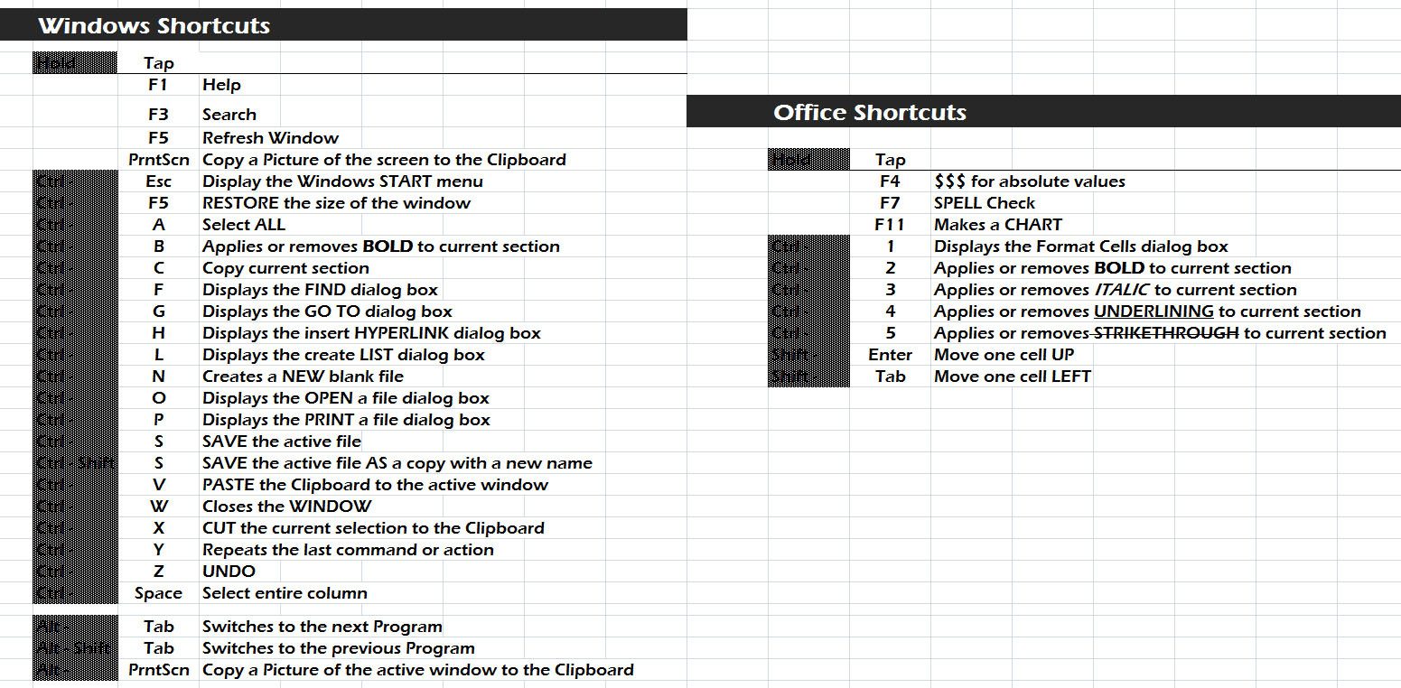
Short cut list. A good way to learn shortcuts is to hover over the command you find you use often and read the shortcut. Force yourself to not click the icon after reading it. Then try the keyboard shortcut.
Another way is to practice with this list I made in school because my teacher's list was such a bad 'ransom note' graphic design horror, I couldn't stand to use it. The school started teaching with my list.
Most designers would recommend Illustrator or another program that is capable for making vectorized images. This is because the image will scale better-- even if you originally drew it at say, 200px by 200px, it could scale up to the size of a billboard without losing quality.
I've also heard Inkscape works well for vector but have yet to try it myself.
Getting used to the pen tool in these programs can be difficult; sometimes it's easier to do a rough drawing of it on paper, scan it, and then work to digitize it as well.
I agree, but I find that Photoshop can do enough vector art to handle many projects.
LOL I work in print so an important part of my unusual design process that I forgot to mention is huge file resolutions. Work at a larger size than how you will publish. PC's today can handle it. I liked to work in 4K before 4K was cool. Printing 4K at 600 dpi is only 6.7". Then I shrink the published final design to fit.
The design process I use is to sketch a logo design in Photoshop using the polygonal lasso tool... make a new layer and trace the sketch using the pen tool to make the vector art... share the vector paths or a place a sketch into Illustrator as needed. zoom the logo size up and down constantly when designing a logo, to see if it still reads when tiny.
@perkelator Seemed to be asking where to start. I was trying to point him to the vector tools in Photoshop before asking him to dive into the deep end that is illustrator. I like to start by sketching with pen or pencil, then raster graphics. Then I make a new vector layer to refine the design over the sketched template.
As you say, illustrator is the way pro's design a logo, but I think a Photoshop n00b can do a good one. My Adobe CS professor said about my preference to use Photoshop to do everything... "When the only tool you have is a hammer, every job starts to look like a nail."
Vector files don't need to be done at a massive size necessarily; if you're using the program correctly you could go up or down in scale with your image and have it maintain it's quality (read: no schmutz or pixellation) perfectly reasonably. But I agree, work large and in charge as much as you can. Especially starting out. And once you've done your large version, scale it down to almost nothing-- because it needs to be readable at small sizes too. (I have to explain the "it needs to look good small and one color" bit to clients fairly often; they forget that their logo won't always be published full color as a full page spread in a magazine lol).
Huge help had it open on other monitor for last few days
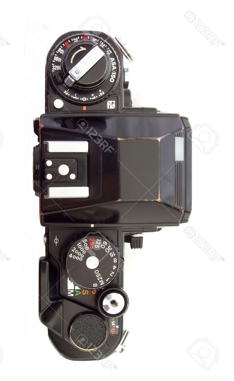
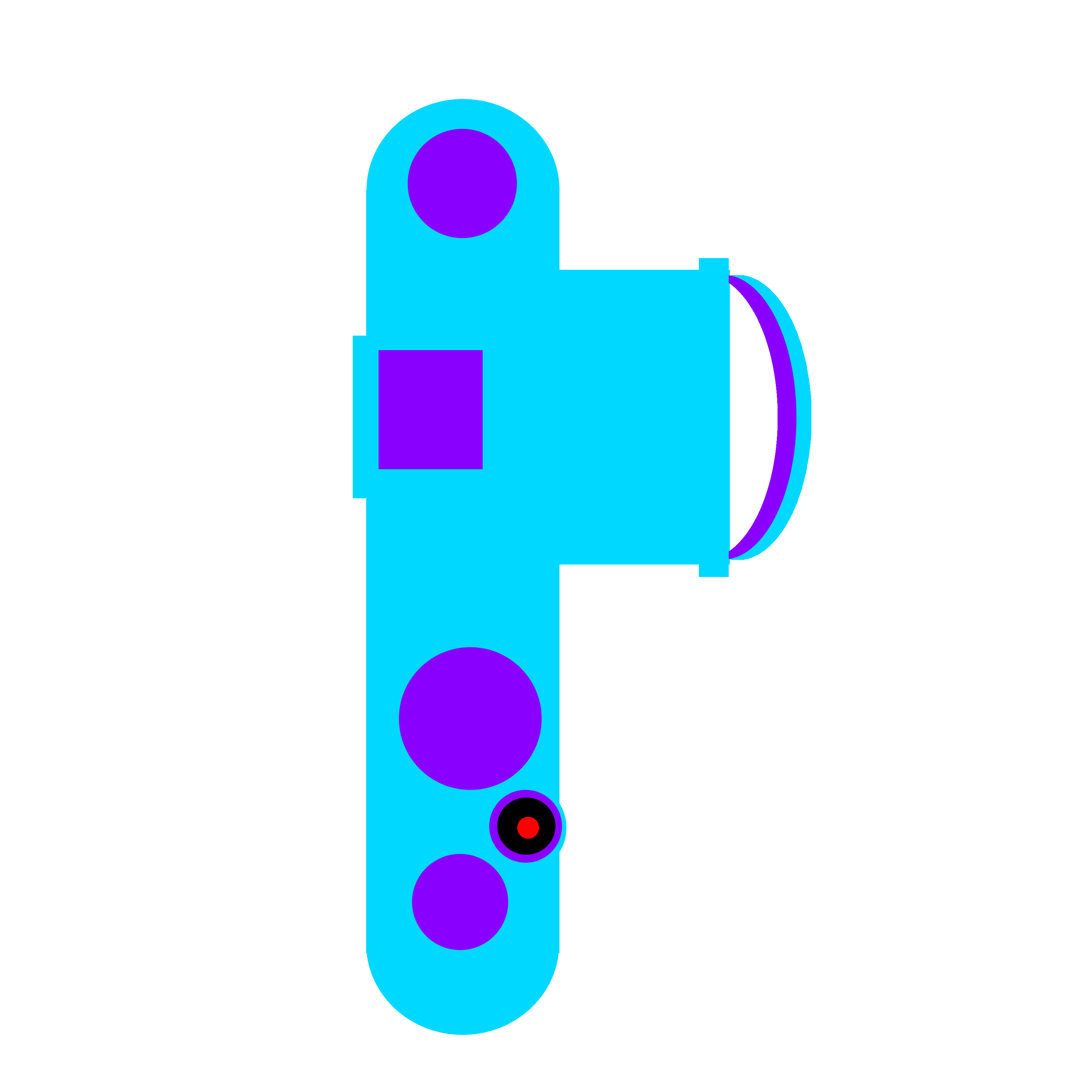
Thank your for the information, sorry for long response time was out of town for a few day. Anyway I am still working on a logo the idea was to make a camera side ways as a P using the lens as the bump and this is what I did first try it looks pretty meh maybe should just do it in black with a white background and I had no idea about the erkelator part i have 2 copies one with the extra text one without. I made the logo at 2000x2000 though it would be big enough and have a copy of it at that size exported as a SVG to rescale I think that is better than just a PNG.
That was what I thought. Thanks for the information. I took that into considderation i have a copy of the logo in SVG so that I can scale it how I want.
Yeah I was going to use it, have Photoshop for next 8 months anyway might as well use it on the old windows dual boot. really just have it for photography for light room, but why not learn it a bit more while I have it for the cheap student price.
Good first try, but keep refining it. A technique I do is print 2 copies and turn off the computer. Tape one to the wall and scribble on the other one.
I like the idea, but I didn't see a camera until you told me. I would get rid of the handgrip on the bottom (it just 'feels' odd to me? The logo doesn't have to be a modern camera.) and rework the camera lens. Your instincts and idea are great but you need the logo to "read" as a camera immediately without having to draw every detail literally.
Alright will do, Feel same way about grip and and lens. I really like the idea need to move it forward. It feels like the body may be a bit to thick for the lens.
Place this image in illustrator or paste it into a Photoshop layer, then draw a few variations over it. I would do a detailed tracing with each part on a different layer. The tracing doesn't have to be perfect, artistic license is allowed. Then turn off layers until your logo is as minimal as possible, but still looks like a camera. Maybe keep the body literal to look like a camera, while making the 'P' bump round to look like the letter (not a lens)?
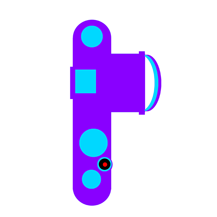
I liked the idea so this is try #2, I liked that image so I used it, Also I liked the way you did the lens i may get rid of the rectangle on the lens before the glass, but it looks more like a camrea now less like a "P" so still needs some work maybe to many dials or may remove the hot shoe. Also may shorten it up a bit, "feels" like it is taller than it needs to be.
Late here but if I'm honest I really don't like that design as a logo, it might work well for other things but to have a truly versatile logo you have to consider where it will be placed, things like whether it will scale well (consider that favicons are 50x50px), consider that it will work well on both light and dark backgrounds (many companies either have one good logo, or have different versions of their logo that would work well on either) and if the logo is meant to be representative of a letter or a symbol, make sure that the average joe will be able to pick up on what it is; if it's meant to be a camera, and while some people may be able to tell, you could ask your friends that aren't necessarily well versed in cameras.
One of the good things is that you've worked and iterated on the design, but I don't think you've done it enough; The best way to go about this is to put down as many ideas as you can think of, and the important part is not to care whether or not the idea currently in your head is bad - if it's an idea, put it down to get it out of your head.
As an example, I will often do many thumbnails to start off with when coming with logo design. Most of these ideas won't be any good, but you'll have more than several ideas to explore later on, and the point is that there might be 3 or 4 that you really really like. The more thumbnails the better, even.
they could be rougher if you want, they don't have to be very good
(have a another 2 images here, but won't let me post since I'm a new member)
if you like one of those ideas a lot, make another set of thumbnails of variants of THAT idea, until you find one you're happy with, and then lastly, experiment with the color schemes or scenarios, you could even tesselate them to see how well they fit together on a wallpaper