As i’ve already hinted at in the New-Stuff thread, i recently learned that CSS has a backdrop-filter Property, that allows for proper Blur. Out of that, i started to create a Fluent Design Inspired theme for this Forum.
Please keep in mind that this is “early Alpha”. I just poked around for an hour and changed what i noticed immidiately. Feel free to try it and put anything you feel is unusable or hard to use here. I’ll try to update this over time.
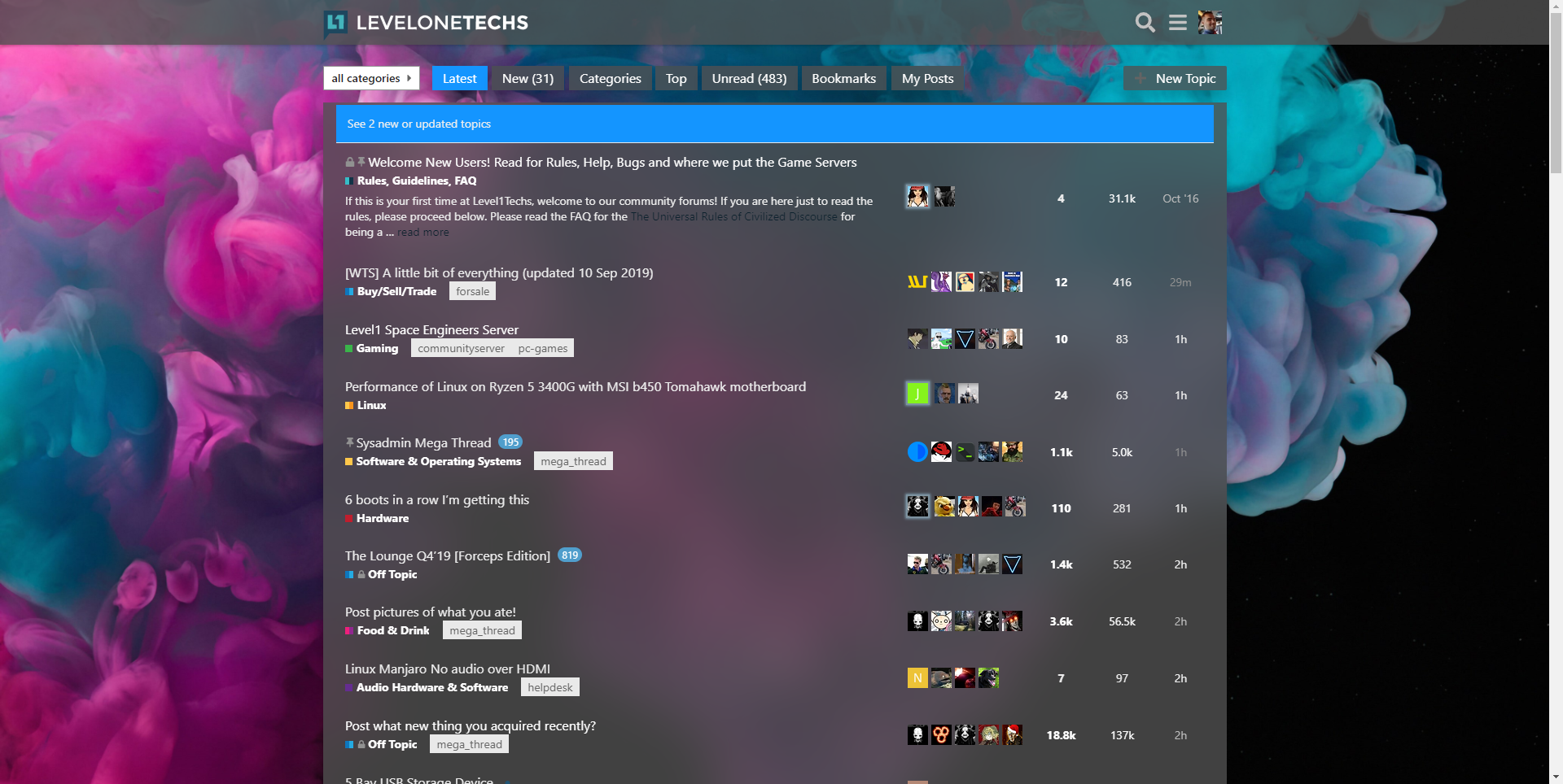
First, some screenshots:

So, to use this, you’ll need some sort of CSS injector extension thingy. I personally use Stylish. If others work, feel free to let me know.
The Full code in it’s current state:
@-moz-document url-prefix("https://forum.level1techs.com") {
html {
    --bg-color: rgba(255,255,255,0.8);
    --bg-color-transparent: rgba(255,255,255,0.3);
    --bg-hover: rgba(220,220,220,0.8);
    --border-dark: rgba(180,180,180,0.8);
	--font-color: #000000;
	--font-color-dim: #444444;
    --highlight-color: #1495FF;
    --bg-image: url("https://cdn.wallpaperhub.app/cloudcache/5/2/4/c/d/8/524cd83dcb2efb20026a1d34f908be18c274240d.jpg");
}

/* html {
    --bg-color: rgba(80,80,80,0.8);
    --bg-color-transparent: rgba(80,80,80,0.3);
    --bg-hover: rgba(220,220,220,0.8);
    --border-dark: rgba(180,180,180,0.8);
    --fg-color: #FFFFFF;
    --fg-color-dim: #EEEEEE;
	--highlight-color: #1495FF;
	--bg-image: url("https://cdn.wallpaperhub.app/cloudcache/6/8/5/2/a/4/6852a4b1b91a97c3a67b78f31f2921757106b08e.jpg");
} */

body {
    font-family: Segoe UI;
    color: var(--fg-color);
    background-image: var(--bg-image);
}

tr {
    border: 1px solid transparent;
}

.nav-pills>li a.active,
#banner, .alert-info{
    background-color: var(--highlight-color) !important;
}

.topic-list-item.visited a.title:not(.badge-notification),
.latest-topic-list-item.visited a.title:not(.badge-notification),
.category-topic-link.visited a.title:not(.badge-notification),
.badge-wrapper.bullet span.badge-category,
.heatmap-high, .heatmap-high a,
body .heatmap-high, .heatmap-med,
.heatmap-med a, body .heatmap-med,
.heatmap-low,
.heatmap-low a,
body .heatmap-low,
.nav-pills>li>a,
.nav-pills>li>a:hover,
.btn{
    color: var(--fg-color) !important;
}

.topic-list .topic-excerpt,
.badge-posts[href],
a:visited,
.topic-list-main-link a.title, .topic-list .main-link a.title, .latest-topic-list-item .main-link a.title,
.topic-list .num{
    color: var(--fg-color-dim);
}

.d-header {
    background-color: var(--bg-color);
}


.menu-panel{
    background-color: var(--bg-color-transparent);
    backdrop-filter: blur(30px) saturate(125%);
    box-shadow: 0 12px 12px rgba(0,0,0,0.15);
    border: none;
}

.topic-area, .full-width, #topic-title,
.nav-pills>li>a,
.btn{
    background-color: var(--bg-color);
    backdrop-filter: blur(30px) saturate(125%);
    box-shadow: 0 12px 12px rgba(0,0,0,0.15);
    border: none;
    border: 1px solid transparent;
}

.user-menu .quick-access-panel .read,
.user-menu .quick-access-panel .show-all a{
    background-color: rgba(255,255,255,0);
    border: 1px solid transparent;
}

.user-menu .quick-access-panel li{
    background-color: rgba(202,226,240,0.5);
    border: 1px solid transparent;
}

.topic-body blockquote, aside.quote .title{
    background-color: rgba(255,255,255,0.5);
}

.user-menu .quick-access-panel .read:hover,
.user-menu .quick-access-panel .read:focus,
tr:hover,
.nav-pills li a:hover{
    background-color: var(--bg-hover);
    border: 1px solid var(--border-dark);
}

.user-menu .quick-access-panel li:hover, .user-menu .quick-access-panel li:focus {
    background-color: rgba(202,226,240,0.7);
    border: 1px solid var(--border-dark);
}
}
Please notice the commented html tags in the beginning. That’s how you switch between dark and light theme variant. The First one is for a light theme, the second for the dark theme.
Both variants also have a background image as a variable, so if you don’t like the ones i use, feel free to change them to what ever.
All of this comes without guarantees that it won’t bork functionality or such. It’s wip and pretty much feels like it. If you come up with changes you feel are needed/wanted, feel free to share them here.
Other than that, let me know what you think.
Edit: I just realized that, in it’s current state, you’d want to choose the “L1T Theme” in you user Preferences, either Light or Dark, to somewhat match the currently unstyled elements.